This article is a continuation of a series of articles on generating synthetic equities datasets for the purposes of machine learning (ML) model training or synthetic backtesting of systematic trading strategies.
We have previously considered the generation of synthetic correlation matrices and the generation of synthetic asset returns via various time series models. In this article we are going to tie the previous two articles together in order to generate correlated asset returns data, which is more realistic (and hence representative) than uncorrelated asset data.
As a sneak preview we will be generating correlated sample paths from two separate models that look like this:
The synthetic data generation will be achieved by calculating correlated random variables from the generated correlation matrices and using these as the random variables that are required by the stochastic process models. To carry this out we can utilise a linear algebra technique known as Cholesky Decomposition, which we will explain shortly.
We will create two new base classes, namely CorrelatedTimeSeriesGenerator and OutputFormatter. The former is designed to produce the actual correlated sample path dataset, whereas the latter can be used to format that data for output in a manner that best suits your downstream application. We will first look at the CorrelatedTimeSeriesGenerator class.
Correlated Time Series Generator
We are going to begin by writing generator.py, which will contain the CorrelatedTimeSeriesGenerator class that will form the basis of our correlated sample path generator. The first task is to import the necessary libraries and modules. We utilise Python's standard typing library to import the List type. Then we import NumPy and the abstract base classes developed within the previous two articles:
# generator.py

from typing import List

import numpy as np

from correlation import CorrelationMatrixGenerator
from models import TimeSeriesModel
The initialisation method __init__ requires a derived subclass implementation of a CorrelationMatrixGenerator and a List of TimeSeriesModels. The reason for providing a list of the latter models, is that we may wish to mix and match various time series models within the same synthetic dataset, in order to improve realism.
Hopefully it should be becoming clearer at this stage why we wrapped both of these models in a class hierarchy. It allows us to swap out various correlation matrix generation and time series models to produce highly varied datasets. It also provides extensibility, as new models can be added to either hierarchy, further increasing the tool's ability to generate realistic synthetic financial pricing series.
The __init__ method sets some attributes from the provided arguments and also conducts a check to ensure that the number of assets in the list of time series models is equal to the size of the correlation matrix generator's size:
# ..
# generator.py
# ..

class CorrelatedTimeSeriesGenerator:
    """
    Generates correlated time series using Cholesky decomposition.
    """

    def __init__(
        self,
        correlation_generator: CorrelationMatrixGenerator,
        time_series_models: List[TimeSeriesModel]
    ):
        """
        Initialize the correlated time series generator.

        Args:
            correlation_generator: Generator for correlation matrices
            time_series_models: List of time series models (one per asset)
        """
        self.correlation_generator = correlation_generator
        self.time_series_models = time_series_models
        self.n_assets = len(time_series_models)

        if self.n_assets != correlation_generator.n:
            raise ValueError(
                f"Number of models ({self.n_assets}) must match "
                f"correlation matrix size ({correlation_generator.n})"
            )
In order to provide some insight into the implementation within the generate method below we are going to provide an information box that explains why we can apply Cholesky Decomposition to the problem of generating correlated random variables. Subsequent to this explanation we will go through the code in more detail. If you are well-versed in linear algebra, feel free to skip straight to the code implementation!
Cholesky Decomposition
When you have independent standard normal random variables (as we can generate with Python's np.random.standard_normal NumPy method) you can transform them into correlated random variables with a specific correlation structure using linear algebra.
If you have a vector of independent standard normal random variables ${\bf z} \sim N(0, \mathbb{I})$ where $\mathbb{I}$ is the identity matrix, and you want to create correlated random variables ${\bf x}$ with correlation matrix ${\bf R}$, you can achieve this through the transformation ${\bf x} = {\bf L} {\bf z}$, where ${\bf L}$ is the Cholesky decomposition of ${\bf R}$ (such that ${\bf R} = {\bf L} {\bf L}^{T}$). This works because the covariance (and correlation, since we're using standard normals) of the transformed variables becomes: $\text{Cov}({\bf x}) = \text{Cov}({\bf L} {\bf z}) = {\bf L} \text{Cov}({\bf z}) {\bf L}^T = {\bf L} \mathbb{I} {\bf L}^T = {\bf L} {\bf L}^T = {\bf R}$.
In the code below, independent_shocks represents the uncorrelated random draws (the ${\bf z}$ vector for each time step), and cholesky_matrix is the ${\bf L}$ matrix. When we calculate independent_shocks @ cholesky_matrix.T, we're applying this linear transformation to create the desired correlation structure.
This approach preserves the marginal distributions, as each individual asset's shocks still follow a standard normal distribution, while introducing the specified correlations between assets. This is crucial for financial modeling because many stochastic processes (like the Geometric Brownian Motion model that we created in the previous article) assume normally distributed draws, and we wish to maintain this property while also capturing the empirical fact that asset returns are often correlated.
We have also included a separate fallback technique when Cholesky decomposition fails. This can happen if the correlation matrix isn't positive definite due to numerical issues. We utilise an eigenvalue decomposition, which achieves the same goal through ${\bf R} = {\bf Q} {\bf \Lambda} {\bf Q}^{T}$, where ${\bf Q}$ contains eigenvectors and ${\bf \Lambda}$ is a diagonal matrix of eigenvalues.
By taking the square root of the eigenvalues and constructing ${\bf L} = {\bf Q} {\bf \Lambda}^{1/2}$, we can calculate an alternative "square root" of the correlation matrix that serves the same purpose. The small positive value of $10^{-8}$ for negative eigenvalues ensures numerical stability while minimally distorting the correlation structure. This robustness is particularly important in financial applications where correlation matrices estimated from data or generated randomly might occasionally have numerical issues that make them slightly non-positive-definite. You will note that we applied a similar technique when we calculated the correlation matrices in the previous article.
Now that we have described the mathematical basis for the Cholesky Decomposition (and the fallback) we can work through the code of the generate method. We first generate an instance of a correlation matrix from the provided model. Then we attempt to perform Cholesky decomposition on this matrix using NumPy's built in optimised algorithm for doing so (np.linalg.cholesky). If we receive a NumPy LinAlgError exception, we can use the eigenvalue decomposition fallback that we described within the info box. Either way, we will end up with a Cholesky matrix (cholesky_matrix) that we can use.
The next step is to generate a 2D NumPy array of standard Normal random variables of size (n_days, n_assets). We then convert them into correlated random variables by right multiplying these variables by the transpose of the Cholesky matrix.
Once the correlated random variables have been generated the placeholder array for the final prices of all correlated sample paths is created (price_matrix). We then iterate over every time series model instance provided in the time_series_models list and generate the appropriate sample path, by passing in the 'correlated shocks' correlated random samples into the model's generate_path method. The NumPy slicing notation price_matrix[:, i] assigns each respective path to the correct row of this matrix.
Finally both the prices and the correlation matrix are returned. We return the latter as we may wish to plot it at the same time as the price series for diagnostic purposes:
# ..
# generator.py
# ..

    def generate(self, n_days: int) -> tuple:
        """
        Generate correlated time series.

        Args:
            n_days: Number of days to simulate

        Returns:
            Tuple of (price_matrix, correlation_matrix) where price_matrix is n_days x n_assets
        """
        # Generate correlation matrix
        correlation_matrix = self.correlation_generator.generate()

        # Perform Cholesky decomposition
        try:
            cholesky_matrix = np.linalg.cholesky(correlation_matrix)
        except np.linalg.LinAlgError:
            # If Cholesky fails, use eigenvalue decomposition as fallback
            eigenvalues, eigenvectors = np.linalg.eigh(correlation_matrix)
            eigenvalues[eigenvalues < 0] = 1e-8
            cholesky_matrix = eigenvectors @ np.diag(np.sqrt(eigenvalues))

        # Generate independent random shocks
        independent_shocks = np.random.standard_normal((n_days, self.n_assets))

        # Create correlated shocks using Cholesky decomposition
        correlated_shocks = independent_shocks @ cholesky_matrix.T

        # Generate price paths for each asset
        price_matrix = np.zeros((n_days, self.n_assets))

        for i, model in enumerate(self.time_series_models):
            price_matrix[:, i] = model.generate_path(n_days, correlated_shocks[:, i])

        return price_matrix, correlation_matrix
This now completes the CorrelatedTimeSeriesGenerator class. We now have the ability to generate correlated price paths using two separate correlation class models and two separate time series models. In order to demonstrate this functionality we are now going to develop a visualisation script that will show some example asset paths generated with this tool.
Correlated Paths Visualisation
The first aspect of the script is to import the necessary libraries. As with previous visualisation scripts we will be using Matplotlib and NumPy. Since we are going to demonstrate both correlation matrix generator types and both time series models, we have imported the appropriate classes from the previous two articles (here and here). Finally, we have also imported the correlated time series generator class itself:
# correlated_visualization.py

from matplotlib.gridspec import GridSpec
import matplotlib.pyplot as plt
import numpy as np

from correlation import (
    BasicFactorCorrelationMatrixGenerator,
    HierarchicalCorrelationMatrixGenerator
)
from models import (
    GeometricBrownianMotion,
    JumpDiffusion
)
from generator import CorrelatedTimeSeriesGenerator
We now define a function called plot_correlated_paths. This function takes in a Matplotlib Axes instance, a 2D NumPy array price_matrix, a title string and the timestep of the simulation dt.
These values are then used to define the number of days, the number of assets and the total time steps in the simulation:
# ..
# correlated_visualization.py
# ..

def plot_correlated_paths(
    ax,
    price_matrix,
    title,
    dt
):
    """
    Plot correlated price paths on given axes.

    Args:
        ax: Matplotlib axes object
        price_matrix: Array of shape (n_days, n_assets) containing price paths
        title: Title for the subplot
        dt: Time step size
    """
    n_days, n_assets = price_matrix.shape
    time_steps = np.arange(n_days) * dt * 252  # Convert to trading days
The next segment of the function uses the Matplotlib viridis colormap to colour the separate asset paths in each instance. Then, all of the paths are plotted by looping over the total number of assets and selecting the appropriate subset of the price_matrix for each plot as well as the appropriate colour from the colour gradient:
# ..
# correlated_visualization.py
# ..

    # Use a gradient color scheme
    colors = plt.cm.viridis(np.linspace(0.2, 0.9, n_assets))

    # Plot all paths
    for i in range(n_assets):
        ax.plot(time_steps, price_matrix[:, i],
                color=colors[i], alpha=0.7, linewidth=1.0,
                label=f'Asset {i+1}' if n_assets <= 5 else None)
The next segment modifies the axis labelling by adding an x-label, a y-label, a title, a grid, setting the legend in the appropriate location and finally setting the numerical limits of the x-axis. That completes the plot_correlated_paths function.
# ..
# correlated_visualization.py
# ..

    # Modify the axis labelling
    ax.set_xlabel('Time (trading days)')
    ax.set_ylabel('Price')
    ax.set_title(title, fontsize=10, fontweight='bold')
    ax.grid(True, alpha=0.3)
    if n_assets <= 5:
        ax.legend(loc='best', fontsize=8)
    ax.set_xlim([0, n_days * dt * 252])
The next function is the main entrypoint. The first segment of this function sets NumPy's random seed to ensure reproducibility of results. Then the number of assets, the number of days, the time step and the starting price for the simulations are all initialised:
# ..
# correlated_visualization.py
# ..

def main():
    # Set random seed for reproducibility
    np.random.seed(42)

    # General configuration
    n_assets = 20  # Number of assets to simulate
    n_days = 252  # One year of daily data
    dt = 1/252  # Daily time step
    start_price = 100.0  # Starting price for all assets
We then configure the parameters for two separate instances of Geometric Brownian Motion (GBM). The first is a low drift, low volatility instance, while the latter is a high drift, high volatility instance. This will allow us to understand how the variation in parameters affects the dataset distribution through time:
# ..
# correlated_visualization.py
# ..

    # === GBM Configuration ===
    # Low drift/volatility configuration (conservative)
    gbm_low_drift = 0.03  # 3% annual drift
    gbm_low_volatility = 0.12  # 12% annual volatility

    # High drift/volatility configuration (aggressive)
    gbm_high_drift = 0.10  # 10% annual drift
    gbm_high_volatility = 0.30  # 30% annual volatility
We similarly specify parameters for two separate instances of the Jump-Diffusion (JD) model. We provide the parameters for a low drift, low vcolatility, low jump intensity model as well as a high drift, high volatility, frequent jump model:
# ..
# correlated_visualization.py
# ..

    # === Jump-Diffusion Configuration ===
    # Low parameters (stable with occasional small jumps)
    jd_low_drift = 0.02  # 2% annual drift
    jd_low_volatility = 0.08  # 8% annual volatility
    jd_low_jump_intensity = 2.0  # Average 2 jumps per year
    jd_low_jump_mean = -0.01  # Small negative jumps on average
    jd_low_jump_std = 0.02  # Low jump variability

    # High parameters (volatile with frequent large jumps)
    jd_high_drift = 0.08  # 8% annual drift
    jd_high_volatility = 0.20  # 20% annual volatility
    jd_high_jump_intensity = 8.0  # Average 8 jumps per year
    jd_high_jump_mean = -0.05  # Larger negative jumps on average
    jd_high_jump_std = 0.10  # High jump variability
Now that the parameters for the time series models have been specified we can create the two separate correlation matrix generator instances with appropriate parameterizations. We create a BasicFactorCorrelationMatrixGenerator instance as well as a HierarchicalCorrelationMatrixGenerator instance. For the latter, we set the number of sector clusters to be five, the intra-cluster correlation of 0.75 and the inter-cluster correlation of 0.25. We also set a 0.05 noise level:
# ..
# correlated_visualization.py
# ..

    # === Create correlation matrix generators ===
    # Basic factor correlation for GBM (moderate correlations)
    basic_corr_gen = BasicFactorCorrelationMatrixGenerator(
        n=n_assets,
        random_factor=20
    )

    # Hierarchical correlation for Jump-Diffusion (sector clustering)
    hierarchical_corr_gen = HierarchicalCorrelationMatrixGenerator(
        n=n_assets,
        n_clusters=5,  # 5 sectors
        intra_cluster_corr=0.75,  # High correlation within sectors
        inter_cluster_corr=0.25,  # Lower correlation between sectors
        noise_level=0.05
    )
Now that we have parameterized the time series models we can create various instances by instantiating each class. However, in order to add some additional variation into each separate asset price path, we are going to create a set of lists of time series models, for each variant, and then add further variation to the drift, volatility (for both GBM and JD) as well as additional variation in the jump intensity, jump mean and jump standard deviation for the JD model.
Hence, for each of the four separate model instances, we are going to end up with 20 differing time series model instances from which we can draw sample paths. This will serve to increase the realism of our synthetic datasets even further:
# ..
# correlated_visualization.py
# ..

    # === Create GBM models ===
    gbm_models_low = [
        GeometricBrownianMotion(
            start_price=start_price,
            dt=dt,
            drift=gbm_low_drift + np.random.normal(0, 0.01),  # Small variation
            volatility=gbm_low_volatility + np.random.normal(0, 0.02)
        ) for _ in range(n_assets)
    ]

    gbm_models_high = [
        GeometricBrownianMotion(
            start_price=start_price,
            dt=dt,
            drift=gbm_high_drift + np.random.normal(0, 0.02),  # Small variation
            volatility=gbm_high_volatility + np.random.normal(0, 0.03)
        ) for _ in range(n_assets)
    ]

    # === Create Jump-Diffusion models ===
    jd_models_low = [
        JumpDiffusion(
            start_price=start_price,
            dt=dt,
            drift=jd_low_drift + np.random.normal(0, 0.01),
            volatility=jd_low_volatility + np.random.normal(0, 0.01),
            jump_intensity=jd_low_jump_intensity + np.random.uniform(-0.5, 0.5),
            jump_mean=jd_low_jump_mean + np.random.normal(0, 0.005),
            jump_std=jd_low_jump_std + np.random.uniform(0, 0.005)
        ) for _ in range(n_assets)
    ]

    jd_models_high = [
        JumpDiffusion(
            start_price=start_price,
            dt=dt,
            drift=jd_high_drift + np.random.normal(0, 0.02),
            volatility=jd_high_volatility + np.random.normal(0, 0.02),
            jump_intensity=jd_high_jump_intensity + np.random.uniform(-1, 1),
            jump_mean=jd_high_jump_mean + np.random.normal(0, 0.01),
            jump_std=jd_high_jump_std + np.random.uniform(0, 0.02)
        ) for _ in range(n_assets)
    ]
With all of the correlation matrix generator and time series models instances created we are now in a position to create our CorrelatedTimeSeriesGenerator instances. These will take one of the above four separate model instance lists, generate correlated random variable samples and use these to generate the actual correlated sample paths from each model.
We first create the generators and then actually generate the paths:
# ..
# correlated_visualization.py
# ..

    # === Create generators ===
    gbm_gen_low = CorrelatedTimeSeriesGenerator(basic_corr_gen, gbm_models_low)
    gbm_gen_high = CorrelatedTimeSeriesGenerator(basic_corr_gen, gbm_models_high)
    jd_gen_low = CorrelatedTimeSeriesGenerator(hierarchical_corr_gen, jd_models_low)
    jd_gen_high = CorrelatedTimeSeriesGenerator(hierarchical_corr_gen, jd_models_high)

    # === Generate correlated time series ===
    print("Generating correlated time series...")
    gbm_prices_low, gbm_corr = gbm_gen_low.generate(n_days)
    gbm_prices_high, _ = gbm_gen_high.generate(n_days)
    jd_prices_low, jd_corr = jd_gen_low.generate(n_days)
    jd_prices_high, _ = jd_gen_high.generate(n_days)
The final part of the main function orchestrates the actual plotting of the sample paths. A large Matplotlib figure is created using a GridSpec object and a collection of subplots. The first row of the subplots contains the two separate GBM model instances (low drift, low vol and high drift, high vol respectively). The GBM models utilise the BasicFactorCorrelationMatrix generator to provide simple correlations between asset paths.
The second row contains the two JD model instances (low drift, low vol, low jump intensity and high drift, high vol, high jump intensity respectively). The JD models utilise the HierarchicalCorrelationMatrixGenerator to increase the correlated path generation realism, by including sector correlations.
We utilise the plot_correlated_paths function, defined above, to actually plot the paths into each subplot. Finally we add a title, some annotated labelling text for each section and then plot the figure:
# ..
# correlated_visualization.py
# ..

    # === Create visualization ===
    fig = plt.figure(figsize=(16, 10))
    gs = GridSpec(2, 2, figure=fig, hspace=0.3, wspace=0.2)

    # Plot 1: GBM Low Parameters (top-left)
    ax1 = fig.add_subplot(gs[0, 0])
    plot_correlated_paths(ax1, gbm_prices_low,
                         f'GBM - Conservative\n($\mu$={gbm_low_drift:.1%}, $\sigma$={gbm_low_volatility:.1%})',
                         dt)

    # Plot 2: GBM High Parameters (top-right)
    ax2 = fig.add_subplot(gs[0, 1])
    plot_correlated_paths(ax2, gbm_prices_high,
                         f'GBM - Aggressive\n($\mu$={gbm_high_drift:.1%}, $\sigma$={gbm_high_volatility:.1%})',
                         dt)

    # Plot 3: Jump-Diffusion Low Parameters (bottom-left)
    ax3 = fig.add_subplot(gs[1, 0])
    plot_correlated_paths(ax3, jd_prices_low,
                         f'Jump-Diffusion - Stable\n($\mu$={jd_low_drift:.1%}, $\sigma$={jd_low_volatility:.1%}, $\lambda$={jd_low_jump_intensity:.1f})',
                         dt, highlight_correlations=True)

    # Plot 4: Jump-Diffusion High Parameters (bottom-right)
    ax4 = fig.add_subplot(gs[1, 1])
    plot_correlated_paths(ax4, jd_prices_high,
                         f'Jump-Diffusion - Volatile\n($\mu$={jd_high_drift:.1%}, $\sigma$={jd_high_volatility:.1%}, $\lambda$={jd_high_jump_intensity:.1f})',
                         dt, highlight_correlations=True)

    # Add main title
    fig.suptitle('Correlated Asset Price Paths: GBM vs Jump-Diffusion Models',
                 fontsize=14, fontweight='bold', y=0.98)

    # Add text annotations about correlation structures
    fig.text(0.5, 0.52, 'Basic Factor Correlation (GBM)',
             ha='center', fontsize=11, style='italic', color='darkblue')
    fig.text(0.5, 0.02, 'Hierarchical Correlation with Sector Clustering (Jump-Diffusion)',
             ha='center', fontsize=11, style='italic', color='darkgreen')

    plt.tight_layout()
    plt.show()
In order to ensure the script can be run from the command line we add in the entrypoint code below:
# ..
# correlated_visualization.py
# ..

if __name__ == "__main__":
    main()
In a suitable virtual environment you can run the following command in the terminal:
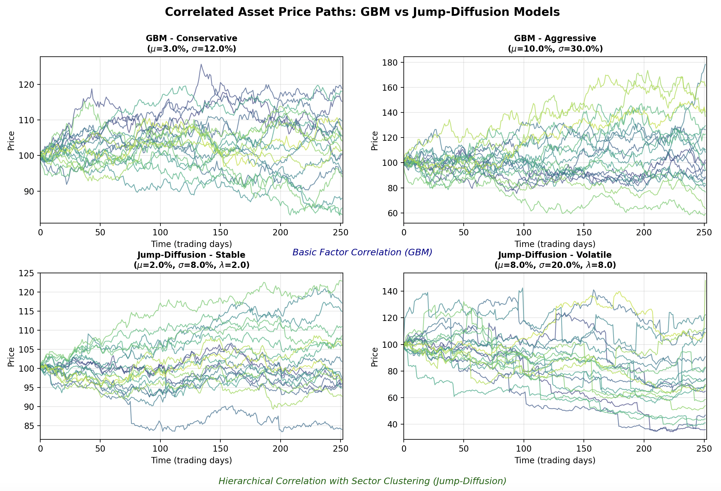
python3 correlated_visualization.pyThe results of this script can be seen in the following figure:
It can be clearly seen that the GBM instances (top row) possess less correlated paths than those of the JD instances (bottom row). This is due to the choice of correlation matrix generator, as the JD instances are drawn from correlation matrices with intra-sector correlations. It can also be seen that increasing the drift and the volatility in both instances (right hand column) increases the spread of the final prices (see y-axis prices across both columns). Finally, the impact of increasing the jump frequency can be seen in the bottom right hand plot, with many of the time series admitting frequent (albeit somewhat unrealistic) jump patterns.
Hopefully it is clear that the object-oriented nature of the tool allows for significant flexibility in generating datasets. It is possible to mix and match models and correlation matrices, as well as individual model parameterisations and start times to create highly varied and realistic synthetic time series data.
Next Steps
In the next article we are going to bring together the classes developed within this article and the previous two in order to produce some large scale synthetic representative equities datasets that can be used to train ML models or used for synthetic backtesting scenarios (e.g. crisis assessment).
Full Code
Note that these files require the files and associated class definitions from the previous two articles in order to work.
# generator.py

from typing import List

import numpy as np

from correlation import CorrelationMatrixGenerator
from models import TimeSeriesModel


class CorrelatedTimeSeriesGenerator:
    """
    Generates correlated time series using Cholesky decomposition.
    """

    def __init__(
        self,
        correlation_generator: CorrelationMatrixGenerator,
        time_series_models: List[TimeSeriesModel]
    ):
        """
        Initialize the correlated time series generator.

        Args:
            correlation_generator: Generator for correlation matrices
            time_series_models: List of time series models (one per asset)
        """
        self.correlation_generator = correlation_generator
        self.time_series_models = time_series_models
        self.n_assets = len(time_series_models)

        if self.n_assets != correlation_generator.n:
            raise ValueError(
                f"Number of models ({self.n_assets}) must match "
                f"correlation matrix size ({correlation_generator.n})"
            )

    def generate(self, n_days: int) -> tuple:
        """
        Generate correlated time series.

        Args:
            n_days: Number of days to simulate

        Returns:
            Tuple of (price_matrix, correlation_matrix) where price_matrix is n_days x n_assets
        """
        # Generate correlation matrix
        correlation_matrix = self.correlation_generator.generate()

        # Perform Cholesky decomposition
        try:
            cholesky_matrix = np.linalg.cholesky(correlation_matrix)
        except np.linalg.LinAlgError:
            # If Cholesky fails, use eigenvalue decomposition as fallback
            eigenvalues, eigenvectors = np.linalg.eigh(correlation_matrix)
            eigenvalues[eigenvalues < 0] = 1e-8
            cholesky_matrix = eigenvectors @ np.diag(np.sqrt(eigenvalues))

        # Generate independent random shocks
        independent_shocks = np.random.standard_normal((n_days, self.n_assets))

        # Create correlated shocks using Cholesky decomposition
        correlated_shocks = independent_shocks @ cholesky_matrix.T

        # Generate price paths for each asset
        price_matrix = np.zeros((n_days, self.n_assets))

        for i, model in enumerate(self.time_series_models):
            price_matrix[:, i] = model.generate_path(n_days, correlated_shocks[:, i])

        return price_matrix, correlation_matrix
# correlated_visualization.py
from matplotlib.gridspec import GridSpec
import matplotlib.pyplot as plt
import numpy as np
from correlation import (
BasicFactorCorrelationMatrixGenerator,
HierarchicalCorrelationMatrixGenerator
)
from models import (
GeometricBrownianMotion,
JumpDiffusion
)
from generator import CorrelatedTimeSeriesGenerator
def plot_correlated_paths(
ax,
price_matrix,
title,
dt,
highlight_correlations=False
):
"""
Plot correlated price paths on given axes.
Args:
ax: Matplotlib axes object
price_matrix: Array of shape (n_days, n_assets) containing price paths
title: Title for the subplot
dt: Time step size
"""
n_days, n_assets = price_matrix.shape
time_steps = np.arange(n_days) * dt * 252 # Convert to trading days
# Use a gradient color scheme
colors = plt.cm.viridis(np.linspace(0.2, 0.9, n_assets))
# Plot all paths
for i in range(n_assets):
ax.plot(time_steps, price_matrix[:, i],
color=colors[i], alpha=0.7, linewidth=1.0,
label=f'Asset {i+1}' if n_assets <= 5 else None)
# Modify the axis labelling
ax.set_xlabel('Time (trading days)')
ax.set_ylabel('Price')
ax.set_title(title, fontsize=10, fontweight='bold')
ax.grid(True, alpha=0.3)
if n_assets <= 5:
ax.legend(loc='best', fontsize=8)
ax.set_xlim([0, n_days * dt * 252])
def main():
# Set random seed for reproducibility
np.random.seed(42)
# General configuration
n_assets = 20 # Number of assets to simulate
n_days = 252 # One year of daily data
dt = 1/252 # Daily time step
start_price = 100.0 # Starting price for all assets
# === GBM Configuration ===
# Low drift/volatility configuration (conservative)
gbm_low_drift = 0.03 # 3% annual drift
gbm_low_volatility = 0.12 # 12% annual volatility
# High drift/volatility configuration (aggressive)
gbm_high_drift = 0.10 # 10% annual drift
gbm_high_volatility = 0.30 # 30% annual volatility
# === Jump-Diffusion Configuration ===
# Low parameters (stable with occasional small jumps)
jd_low_drift = 0.02 # 2% annual drift
jd_low_volatility = 0.08 # 8% annual volatility
jd_low_jump_intensity = 2.0 # Average 2 jumps per year
jd_low_jump_mean = -0.01 # Small negative jumps on average
jd_low_jump_std = 0.02 # Low jump variability
# High parameters (volatile with frequent large jumps)
jd_high_drift = 0.08 # 8% annual drift
jd_high_volatility = 0.20 # 20% annual volatility
jd_high_jump_intensity = 8.0 # Average 8 jumps per year
jd_high_jump_mean = -0.05 # Larger negative jumps on average
jd_high_jump_std = 0.10 # High jump variability
# === Create correlation matrix generators ===
# Basic factor correlation for GBM (moderate correlations)
basic_corr_gen = BasicFactorCorrelationMatrixGenerator(n=n_assets, random_factor=20)
# Hierarchical correlation for Jump-Diffusion (sector clustering)
hierarchical_corr_gen = HierarchicalCorrelationMatrixGenerator(
n=n_assets,
n_clusters=5, # 5 sectors
intra_cluster_corr=0.75, # High correlation within sectors
inter_cluster_corr=0.25, # Lower correlation between sectors
noise_level=0.05
)
# === Create GBM models ===
gbm_models_low = [
GeometricBrownianMotion(
start_price=start_price,
dt=dt,
drift=gbm_low_drift + np.random.normal(0, 0.01), # Small variation
volatility=gbm_low_volatility + np.random.normal(0, 0.02)
) for _ in range(n_assets)
]
gbm_models_high = [
GeometricBrownianMotion(
start_price=start_price,
dt=dt,
drift=gbm_high_drift + np.random.normal(0, 0.02), # Small variation
volatility=gbm_high_volatility + np.random.normal(0, 0.03)
) for _ in range(n_assets)
]
# === Create Jump-Diffusion models ===
jd_models_low = [
JumpDiffusion(
start_price=start_price,
dt=dt,
drift=jd_low_drift + np.random.normal(0, 0.01),
volatility=jd_low_volatility + np.random.normal(0, 0.01),
jump_intensity=jd_low_jump_intensity + np.random.uniform(-0.5, 0.5),
jump_mean=jd_low_jump_mean + np.random.normal(0, 0.005),
jump_std=jd_low_jump_std + np.random.uniform(0, 0.005)
) for _ in range(n_assets)
]
jd_models_high = [
JumpDiffusion(
start_price=start_price,
dt=dt,
drift=jd_high_drift + np.random.normal(0, 0.02),
volatility=jd_high_volatility + np.random.normal(0, 0.02),
jump_intensity=jd_high_jump_intensity + np.random.uniform(-1, 1),
jump_mean=jd_high_jump_mean + np.random.normal(0, 0.01),
jump_std=jd_high_jump_std + np.random.uniform(0, 0.02)
) for _ in range(n_assets)
]
# === Create generators ===
gbm_gen_low = CorrelatedTimeSeriesGenerator(basic_corr_gen, gbm_models_low)
gbm_gen_high = CorrelatedTimeSeriesGenerator(basic_corr_gen, gbm_models_high)
jd_gen_low = CorrelatedTimeSeriesGenerator(hierarchical_corr_gen, jd_models_low)
jd_gen_high = CorrelatedTimeSeriesGenerator(hierarchical_corr_gen, jd_models_high)
# === Generate correlated time series ===
print("Generating correlated time series...")
gbm_prices_low, gbm_corr = gbm_gen_low.generate(n_days)
gbm_prices_high, _ = gbm_gen_high.generate(n_days)
jd_prices_low, jd_corr = jd_gen_low.generate(n_days)
jd_prices_high, _ = jd_gen_high.generate(n_days)
# === Create visualization ===
fig = plt.figure(figsize=(16, 10))
gs = GridSpec(2, 2, figure=fig, hspace=0.3, wspace=0.2)
# Plot 1: GBM Low Parameters (top-left)
ax1 = fig.add_subplot(gs[0, 0])
plot_correlated_paths(ax1, gbm_prices_low,
f'GBM - Conservative\n($\mu$={gbm_low_drift:.1%}, $\sigma$={gbm_low_volatility:.1%})',
dt)
# Plot 2: GBM High Parameters (top-right)
ax2 = fig.add_subplot(gs[0, 1])
plot_correlated_paths(ax2, gbm_prices_high,
f'GBM - Aggressive\n($\mu$={gbm_high_drift:.1%}, $\sigma$={gbm_high_volatility:.1%})',
dt)
# Plot 3: Jump-Diffusion Low Parameters (bottom-left)
ax3 = fig.add_subplot(gs[1, 0])
plot_correlated_paths(ax3, jd_prices_low,
f'Jump-Diffusion - Stable\n($\mu$={jd_low_drift:.1%}, $\sigma$={jd_low_volatility:.1%}, $\lambda$={jd_low_jump_intensity:.1f})',
dt, highlight_correlations=True)
# Plot 4: Jump-Diffusion High Parameters (bottom-right)
ax4 = fig.add_subplot(gs[1, 1])
plot_correlated_paths(ax4, jd_prices_high,
f'Jump-Diffusion - Volatile\n($\mu$={jd_high_drift:.1%}, $\sigma$={jd_high_volatility:.1%}, $\lambda$={jd_high_jump_intensity:.1f})',
dt, highlight_correlations=True)
# Add main title
fig.suptitle('Correlated Asset Price Paths: GBM vs Jump-Diffusion Models',
fontsize=14, fontweight='bold', y=0.98)
# Add text annotations about correlation structures
fig.text(0.5, 0.48, 'Basic Factor Correlation (GBM)',
ha='center', fontsize=11, style='italic', color='darkblue')
fig.text(0.5, 0.02, 'Hierarchical Correlation with Sector Clustering (Jump-Diffusion)',
ha='center', fontsize=11, style='italic', color='darkgreen')
plt.tight_layout()
plt.show()
if __name__ == "__main__":
main()