In this article the concept of unsupervised clustering will be considered. In quantitative finance finding groups of similar assets, or regimes in asset price series is extremely useful. It can aid in the development of filters, or entry and exit rules. This helps improve profitability for certain trading strategies.
Clustering is an unsupervised learning method that attempts to partition observational data into separate subgroups or clusters. The desired outcome of clustering is to ensure observations within clusters are similar to each other but different to observations in other clusters.
Clustering is a vast area of academic research and it would be difficult to provide a full taxonomy of clustering algorithms in this article. Instead this article will concentrate on a widely utilised technique known as K-Means Clustering.
K-Means Clustering will be applied to daily "bar" data–open, high, low, close–in order to identify separate "candlestick" clusters. These clusters can then be used to ascertain if certain market regimes exist, as with Hidden Markov Models.
K-Means Clustering
K-Means Clustering is a particular technique for identifying subgroups or clusters within a set of observations. It is a hard clustering technique, which means that each observation is forced to have a unique cluster assignment. This is in contrast to a soft, or probabilistic, clustering technique, which assigns probabilites for cluster membership instead.
To use K-Means Clustering it is necessary to specify a parameter $K$, which is the number of desired clusters to partition the data into. These $K$ clusters do not overlap and have "hard" boundaries between membership (see the figure below). The task is to assign each of the $N$ observations into one of the $K$ clusters, where each observation belongs to a cluster with the closest mean feature/observation vector.
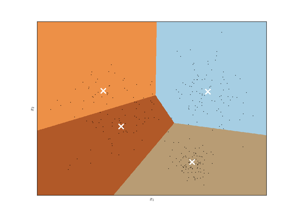 K-Means Clustering "hard" boundary locations, with feature vector centroids marked as a white cross. [Click for a larger image]
Mathematically we can define sets $S_k$, $k \in \{ 1,\ldots,K \}$, each of which contains the indices of the subset of the $N$ observations that lie in each cluster. These sets exhaustively cover all indices, that is each observation belongs to at least one of the sets $S_k$ and the clusters are mutually exclusive with "hard" boundaries:
- ${\bf S} = \bigcup_{k=1}^K S_k = \{ 1,\ldots,N \}$
- $S_k \cap S_{k'} = \phi, \quad \forall k \neq k'$
The goal of K-Means Clustering is to minimise the Within-Cluster Variation (WCV), also known as the Within-Cluster Sum of Squares (WCSS). This concept represents the sum across clusters of the sum of distances to each point in the cluster to its mean. That is, it measures how much observations within a cluster differ from each other. Hence it is necessary to minimise:
\begin{eqnarray} \text{argmin}_{\bf S} \sum_{k=1}^K \sum_{{\bf x}_i \in S_k} \| {\bf x}_i - {\bf \mu}_k \| \end{eqnarray}
Where ${\bf \mu}_k$ represents the mean feature vector of cluster $k$ and ${\bf x}_i$ is the $i$th feature vector in cluster $k$.
Unfortunately this particular minimisation is difficult to solve globally. That is, finding a global minimum to this problem is NP-hard in the complexity sense.
Fortunately however there exists useful heuristic algorithms for finding acceptable local optima.
The Algorithm
The heuristic algorithm to solve K-Means Clustering is, understandably, known as the K-Means algorithm. It is relatively straightforward to conceptualise. It consists of two steps, the second of which is iterated until completion:
- Assign each observation ${\bf x}_i$ to a random cluster $k$.
- Iterate the following until cluster assignment remains fixed:
- Compute each cluster's mean feature vector, the centroid ${\bf \mu}_k$.
- Assign each observation ${\bf x}_i$ to the closest ${\bf \mu}_k$, where "closeness" is given by standard Euclidean distance.
It won't be discussed here why this algorithm guarantees to find a local optimum. For a more detailed discussion of the mathematical theory behind this see James et al (2009)[1] and Hastie et al (2009)[2].
Note that because the initial cluster assignments are randomly assigned the local optimum determined is heavily dependent upon these initial assignments. In practice the algorithm is run multiple times (the default for Scikit-Learn is ten times) and the best local optimum is chosen–that is the one that minimises the WCSS the most.
Issues
The K-Means algorithm is not without its flaws. One of the biggest problems in quantitative finance is that the signal-to-noise ratio of financial pricing data is low, which makes it hard to extract the predictive signal used for trading strategies.
The nature of the K-Means algorithm is such that it is forced to generate $k$ clusters, even if the data is highly noisy. This has the obvious implication that such "clusters" are not truly separate distributions of data but are really artifacts of a noisy dataset. This is a tricky problem to deal with in quantitative trading.
Another aspect of specifying a $k$ is that certain outlier data points will automatically be assigned to a cluster, whether they are truly part of the "distribution" that generated them or not. This is due to the necessity of imposing a hard cluster boundary. In finance "outlier" data points are not uncommon, not least due to errors or bad ticks but also due to flash crashes and other rapid changes to an asset price.
In addition the clustering method itself is quite sensitive to variations in the underlying dataset. That is, if a financial asset pricing series is split into two and two separate K-Means algorithms were fitted to each, sharing the same $k$ parameter, it is common to see two very different cluster assignments. This begs the question as to how robust such a mechanism is on small financial data sets. As always, more data can be helpful in this instance.
Such issues motivate more sophisticated clustering algorithms, which unfortunately are beyond the scope of this article due to both the range of the methods as well as their increased mathematical sophistication. However, for those who are interested in delving deeper into unsupervised clustering, the following methods should be considered:
- Gaussian Mixture Models/Expectation-Maximisation Algorithm
- DBSCAN and OPTICS algorithms
- Deep Neural Network Architectures: Autoencoders and Restricted Boltzmann Machines
Attention will now turn towards simulating data and fitting the K-Means algorithm to it.
Simulated Data
In this section K-Means Clustering will be applied to a set of simulated data in order to provide familiarisation with the specific Scikit-Learn implementation of the algorithm. It will also be shown how the choice of $k$ in the algorithm is extremely important in making sure good results are achieved.
The task will involve sampling three separate two-dimensional Gaussian distributions to create a selection of observation data. The K-Means Algorithm will then be used, with various choices of the parameter $k$ to infer cluster membership. A comparison of two separate choices for $k$ will be plotted along with inferred cluster membership by colour.
Similar simulated data exercises have been carried out in previous articles on the site. They help identify the potential flaws in models on synthetic data, the statistical properties of which are easily controlled. This provides strong insight into the limitation of such models prior to their application on real financial data, where we most certainly cannot control the statistical properties!
The first step is to import the necessary libraries. The Python itertools library is used to chain lists of lists together when generating the random sample data. Itertools is an extremely useful library, which can save a significant amount of development time. Reading through the documentation is a good exercise for any budding quant developer or trader.
The remaining imports are NumPy, Matplotlib and the KMeans class from Scikit-Learn, which lives in the cluster module:
# simulated_data.py

import itertools

import numpy as np
import matplotlib.pyplot as plt
from sklearn.cluster import KMeans
The first task within the __main__ function is to set the random seed so that the code below is completely reproducible. Subsequently the number of samples for each cluster is set (samples=100), as well as the two-dimensional means and covariance matrices of each Gaussian cluster (one per element in each list).
The norm_dists list contains three separate two-dimensional lists of observations, one for each cluster, generated using a list comprehension. Finally the observational data $X$ is generated by chaining each of these sublists using the itertools library:
np.random.seed(1)

# Set the number of samples, the means and
# variances of each of the three simulated clusters
samples = 100
mu = [(7, 5), (8, 12), (1, 10)]
cov = [
    [[0.5, 0], [0, 1.0]],
    [[2.0, 0], [0, 3.5]],
    [[3, 0], [0, 5]],
]

# Generate a list of the 2D cluster points
norm_dists = [
    np.random.multivariate_normal(m, c, samples)
    for m, c in zip(mu, cov)
]
X = np.array(list(itertools.chain(*norm_dists)))
As with many Scikit-Learn implementations of machine learning models the API is exceedingly simple. In this case it consists of initialising the KMeans class with the n_clusters parameter, representing the number of clusters to find, and then calling the fit method on the observational data. The cluster assignments can be extracted from the labels_ property.
In the following snippet this procedure is carried out for both $k=3$ and $k=4$ on the same dataset:
# Apply the K-Means Algorithm for k=3, which is
# equal to the number of true Gaussian clusters
km3 = KMeans(n_clusters=3)
km3.fit(X)
km3_labels = km3.labels_

# Apply the K-Means Algorithm for k=4, which is
# larger than the number of true Gaussian clusters
km4 = KMeans(n_clusters=4)
km4.fit(X)
km4_labels = km4.labels_
The final section simply makes two Matplotlib scatter plot subplots of the data, one for $k=3$ and one for $k=4$, using colours to represent cluster assignments by the K-Means algorithm:
# Create a subplot comparing k=3 and k=4
# for the K-Means Algorithm
fig, (ax1, ax2) = plt.subplots(1, 2, figsize=(14,6))
ax1.scatter(X[:, 0], X[:, 1], c=km3_labels.astype(np.float))
ax1.set_xlabel("$x_1$")
ax1.set_ylabel("$x_2$")
ax1.set_title("K-Means with $k=3$")
ax2.scatter(X[:, 0], X[:, 1], c=km4_labels.astype(np.float))
ax2.set_xlabel("$x_1$")
ax2.set_ylabel("$x_2$")
ax2.set_title("K-Means with $k=4$")
plt.show()
The output of the code can be seen below:
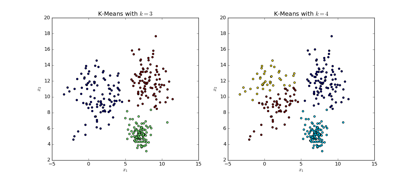 K-Means Algorithm on Simulated Data with $k=3$ and $k=4$}. [Click for a larger image]
Note that the colour differences between the two plots only represent the fact that there are different numbers of clusters, rather than any other implicit relationship.
The full two-dimensional set of data was generated by sampling from three separate Gaussian distributions with differing means and variances. It is immediately apparent that the choice of $k$ when carrying out the K-Means algorithm is important for the interpretation of results.
In the left subplot the algorithm is forced to choose three clusters. It has largely captured the three separate Gaussian clusters, assigning blue, red and green colours to each. Although it clearly has difficulty in selecting the closest clusters for the "outlying" points of each cluster that lies in the neighbourhood of $x_1=5,x_2=8$. This is a difficult situation for any clustering algorithm that involves "overlapping" data.
Recall that the K-Means algorithm is a hard clustering tool. That is, it creates a distinct "hard" boundary between cluster membership, rather than probabalistically assigning membership as in a "soft" cluster algorithm.
In the right subplot the algorithm is forced to choose four clusters and has divided the true grouping on the left hand side of the plot into two separate regions (yellow and red). However it is known that this cluster was generated from a single Gaussian distribution and hence the algorithm has "incorrectly" assigned the data. The remaining clusters on the right hand side are "correctly" identified however.
The choice of $k$ has significant implications for the usefulness of the algorithm–particularly with regard to quantitative trading applications. It will be seen shortly how the choice of $k$ can have a large impact on the effectiveness of the predictive ability on real financial data.
OHLC Clustering
In this section K-Means Clustering will be used on daily Open-High-Low-Close (OHLC) data, also known as bars or candles. Such analysis is interesting because it considers extra dimensions to daily data that are often ignored, in favour of making sole use of adjusted closing prices.
Because it is important to compare each candle on a "like-for-like" basis, each of the High, Low and Close dimensions will be normalised by the corresponding Open price. This has the added benefit that stock splits, dividends and other "discrete" price-affecting corporate actions will automatically be accounted for. By normalising each candle in this manner, the dimensionality is reduced from four (Open, High, Low, Close) to three (High/Open, Low/Open, Close/Open).
In the following code two years of S&P500 data will be downloaded. The bars will then be plotted using Matplotlib. The data will then be normalised in the manner described above, clustered using K-Means and then plotted in a three-dimensional scatterplot to visualise cluster membership.
These cluster labels will then be applied back to the original candle data and used to visualise cluster membership (as well as boundaries) on a cluster label-ordered candlestick chart. Finally, a "follow-on matrix" will be created, which describes the frequency of tomorrow's cluster being $j$, if today's cluster is $i$. Such a matrix is useful for ascertaining whether there is any scope for forming a predictive trading strategy based on today's cluster membership.
This section of code requires many imports. The majority of these are due to necessary formatting options for Matplotlib. The copy standard library is brought in to make deep copies of DataFrames so that they are not overwritten by each subsequent plot function. In addition NumPy and Pandas are imported for data manipulation. Finally the KMeans module is imported from Scikit-Learn:
# ohlc_clustering.py

import copy
import datetime

import matplotlib.pyplot as plt
from mpl_toolkits.mplot3d import Axes3D
from matplotlib.finance import candlestick_ohlc
import matplotlib.dates as mdates
from matplotlib.dates import (
    DateFormatter, WeekdayLocator, DayLocator, MONDAY
)
import numpy as np
import pandas as pd
import pandas_datareader.data as web
from sklearn.cluster import KMeans
The first function takes a symbol string for an equities ticker, as well as starting and ending dates, and uses these to create a three-dimensional time series. Each dimension represents the High, Low and Close price normalised by the Open price, respectively. The remaining columns are dropped and the DataFrame is returned:
def get_open_normalised_prices(symbol, start, end):
    """
    Obtains a pandas DataFrame containing open normalised prices
    for high, low and close for a particular equities symbol
    from Yahoo Finance. That is, it creates High/Open, Low/Open
    and Close/Open columns.
    """
    df = web.DataReader(symbol, "yahoo", start, end)
    df["H/O"] = df["High"]/df["Open"]
    df["L/O"] = df["Low"]/df["Open"]
    df["C/O"] = df["Close"]/df["Open"]
    df.drop(
        [
            "Open", "High", "Low",
            "Close", "Volume", "Adj Close"
        ],
        axis=1, inplace=True
    )
    return df
The following function plot_candlesticks makes use of the Matplotlib candlestick_ohlc method to create a financial candlestick chart of the provided price series. The majority of the function involves specific Matplotlib formatting to achieve correct data formatting. The comments explain each setting in more depth:
def plot_candlesticks(data, since):
    """
    Plot a candlestick chart of the prices,
    appropriately formatted for dates
    """
    # Copy and reset the index of the dataframe
    # to only use a subset of the data for plotting
    df = copy.deepcopy(data)
    df = df[df.index >= since]
    df.reset_index(inplace=True)
    df['date_fmt'] = df['Date'].apply(
        lambda date: mdates.date2num(date.to_pydatetime())
    )

    # Set the axis formatting correctly for dates
    # with Mondays highlighted as a "major" tick
    mondays = WeekdayLocator(MONDAY)
    alldays = DayLocator()
    weekFormatter = DateFormatter('%b %d')
    fig, ax = plt.subplots(figsize=(16,4))
    fig.subplots_adjust(bottom=0.2)
    ax.xaxis.set_major_locator(mondays)
    ax.xaxis.set_minor_locator(alldays)
    ax.xaxis.set_major_formatter(weekFormatter)

    # Plot the candlestick OHLC chart using black for
    # up days and red for down days
    csticks = candlestick_ohlc(
        ax, df[
            ['date_fmt', 'Open', 'High', 'Low', 'Close']
        ].values, width=0.6,
        colorup='#000000', colordown='#ff0000'
    )
    ax.set_axis_bgcolor((1,1,0.9))
    ax.xaxis_date()
    plt.setp(
        plt.gca().get_xticklabels(),
        rotation=45, horizontalalignment='right'
    )
    plt.show()
The following function plot_3d_normalised_candles makes a scatter plot in three-dimensional space of all of the candles, normalised by the open price. Each daily candle bar is coloured according to cluster membership (which is determined in subsequent code snippets below):
def plot_3d_normalised_candles(data):
    """
    Plot a 3D scatterchart of the open-normalised bars
    highlighting the separate clusters by colour
    """
    fig = plt.figure(figsize=(12, 9))
    ax = Axes3D(fig, elev=21, azim=-136)
    ax.scatter(
        data["H/O"], data["L/O"], data["C/O"],
        c=labels.astype(np.float)
    )
    ax.set_xlabel('High/Open')
    ax.set_ylabel('Low/Open')
    ax.set_zlabel('Close/Open')
    plt.show()
The next function plot_cluster_ordered_candles is similar to the above candlestick plot, except that it is now ordered by cluster membership, rather than date. In addition each cluster boundary is visualised with a blue dotted line. The function is somewhat complex, but once again this is mainly due to formatting issues with Matplotlib.
The latter section of the function involves creating a separate DataFrame called change_indices. Its job is to determine the index at which a new cluster boundary is located. This is done by sorting all elements by their cluster index and then using the diff method to obtain the change points. This is then filtered by all values that do not equal zero, which returns a DataFrame consisting of five rows, one for each boundary. This is then used by the Matplotlib axvline method to plot the dotted blue line:
def plot_cluster_ordered_candles(data):
    """
    Plot a candlestick chart ordered by cluster membership
    with the dotted blue line representing each cluster
    boundary.
    """
    # Set the format for the axis to account for dates
    # correctly, particularly Monday as a major tick
    mondays = WeekdayLocator(MONDAY)
    alldays = DayLocator()
    weekFormatter = DateFormatter("")
    fig, ax = plt.subplots(figsize=(16,4))
    ax.xaxis.set_major_locator(mondays)
    ax.xaxis.set_minor_locator(alldays)
    ax.xaxis.set_major_formatter(weekFormatter)

    # Sort the data by the cluster values and obtain
    # a separate DataFrame listing the index values at
    # which the cluster boundaries change
    df = copy.deepcopy(data)
    df.sort_values(by="Cluster", inplace=True)
    df.reset_index(inplace=True)
    df["clust_index"] = df.index
    df["clust_change"] = df["Cluster"].diff()
    change_indices = df[df["clust_change"] != 0]

    # Plot the OHLC chart with cluster-ordered "candles"
    csticks = candlestick_ohlc(
        ax, df[
            ["clust_index", 'Open', 'High', 'Low', 'Close']
        ].values, width=0.6,
        colorup='#000000', colordown='#ff0000'
    )
    ax.set_axis_bgcolor((1,1,0.9))

    # Add each of the cluster boundaries as a blue dotted line
    for row in change_indices.iterrows():
        plt.axvline(
            row[1]["clust_index"],
            linestyle="dashed", c="blue"
        )
    plt.xlim(0, len(df))
    plt.setp(
        plt.gca().get_xticklabels(),
        rotation=45, horizontalalignment='right'
    )
    plt.show()
The final function is create_follow_cluster_matrix. Its job is to produce a $k \times k$ matrix, where $k$ is the number of selected clusters in the K-Means Clustering process. Each element of the matrix represents the percentage frequency of cluster $j$ being the daily follow-on cluster to cluster $i$. This is useful in quantitative trading setting as it allows us to determine the sample distribution of cluster changes.
The matrix is constructed using the Pandas shift method, which allows a new column ClusterTomorrow to contain tomorrow's cluster value. A ClusterMatrix column is then created by forming a tuple of today's cluster index and tomorrow's cluster index. The Pandas value_counts method is then used to create a frequency distribution of these pairs. Finally, the $k \times k$ NumPy matrix is created and filled with the percentage frequency of occurance of each cluster follow-on:
def create_follow_cluster_matrix(data):
    """
    Creates a k x k matrix, where k is the number of clusters
    that shows when cluster j follows cluster i.
    """
    data["ClusterTomorrow"] = data["Cluster"].shift(-1)
    data.dropna(inplace=True)
    data["ClusterTomorrow"] = data["ClusterTomorrow"].apply(int)
    sp500["ClusterMatrix"] = list(zip(data["Cluster"], data["ClusterTomorrow"]))
    cmvc = data["ClusterMatrix"].value_counts()
    clust_mat = np.zeros( (k, k) )
    for row in cmvc.iteritems():
        clust_mat[row[0]] = row[1]*100.0/len(data)
    print("Cluster Follow-on Matrix:")
    print(clust_mat)
The __main__ function ties all of the above functions together. It carries out the K-Means algorithm and uses these cluster membership values in all subsequent functions:
if __name__ == "__main__":
    # Obtain S&P500 pricing data from Yahoo Finance
    start = datetime.datetime(2013, 1, 1)
    end = datetime.datetime(2015, 12, 31)
    sp500 = web.DataReader("^GSPC", "yahoo", start, end)

    # Plot last year of price "candles"
    plot_candlesticks(sp500, datetime.datetime(2015, 1, 1))

    # Carry out K-Means clustering with five clusters on the
    # three-dimensional data H/O, L/O and C/O
    sp500_norm = get_open_normalised_prices(sp500, start, end)
    k = 5
    km = KMeans(n_clusters=k, random_state=42)
    km.fit(sp500_norm)
    labels = km.labels_
    sp500["Cluster"] = labels

    # Plot the 3D normalised candles using H/O, L/O, C/O
    plot_3d_normalised_candles(sp500_norm)

    # Plot the full OHLC candles re-ordered
    # into their respective clusters
    plot_cluster_ordered_candles(sp500)

    # Create and output the cluster follow-on matrix
    create_follow_cluster_matrix(sp500)
The output of the cluster follow-on matrix is as follows:
Cluster Follow-on Matrix:
[[ 14.70198675   4.37086093   1.05960265   5.43046358  12.45033113]
 [  4.76821192   1.7218543    0.66225166   1.45695364   3.31125828]
 [  0.52980132   0.92715232   0.52980132   0.66225166   1.7218543 ]
 [  3.57615894   2.78145695   1.05960265   2.51655629   4.2384106 ]
 [ 14.43708609   1.98675497   1.05960265   4.2384106    9.8013245 ]]
It can be seen that this is certainly not an evenly distributed matrix. That is, certain "candles" are likely to follow others with more frequency. This motivates the possibility of forming trading strategies around cluster identification and prediction of subsequent clusters.
The figure below displays the candles for a years worth of the S&P500 OHLC prices for 2015. Note the steep drop around late August and subsequent slow recovery in October and November:
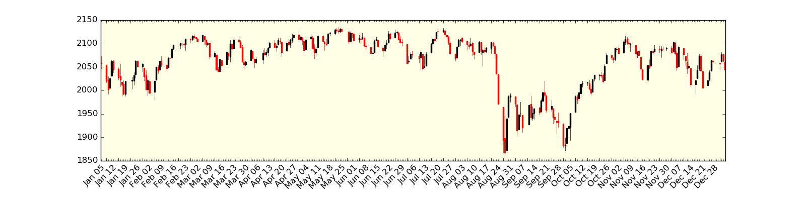 S&P500 candlestick bars for the year 2015. [Click for a larger image]
The figure below is a three-dimensional plot of High/Open, Low/Open and Close/Open plotted against each other. Each of the $k=5$ clusters has been coloured. It is clear the the majority of the bars are located around $(1.0, 1.0, 1.0)$. This makes sense as most days are not hugely volatile and hence the prices do not trade in too large a range.
However, there are many days when the closing price is substantially above the opening price as is evidenced by the light blue cluster in the top of the figure. In addition there are many days when the low point is substantially below the opening price, indicated by the light green cluster:
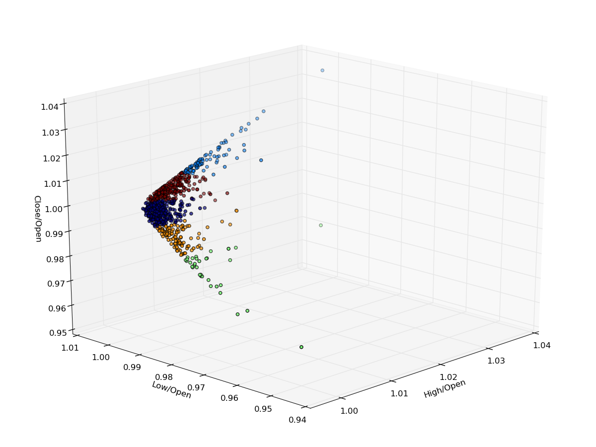 3D scatterplot of normalised bars along with cluster membership. [Click for a larger image]
The figure below displays the candles for 2013-2015 inclusive ordered by cluster membership. This visualisation makes it clear how the K-Means algorithm works on candle data. There are two large clusters at either end of the chart that represent slight down days and slight up days, respectively. Within the middle of the chart more severe gains and drops can be seen.
One interesting point to note is that the cluster membership is highly unequal. There are many more lesser volatile days than there are higher volatile days. The central cluster in particular contains days with steep declines:
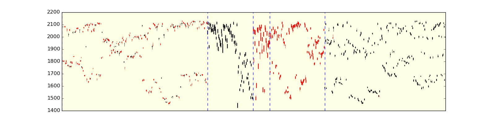 S&P500 candlestick bars for 2013-2015 inclusive ordered via cluster membership, overlaid with cluster boundaries (blue dotted lines). [Click for a larger image]
This analysis is certainly interesting and motivates further study. However a significant amount of extra work is required to carry out any form of quantitative trading strategy. In particular, the above is restricted to the two most recent full years of S&P500 daily data. It could easily be extended further back in time, or across many more assets (equities or otherwise).
In addition it is not clear if the choice of $k=5$ is a good one. Perhaps $k=4$ or $k=6$ might reveal more structure. Should $k$ be chosen on an asset-by-asset basis and if so, under what "goodness" metric?
Another problem is that all of this work is in-sample. Any future usage of this as a predictive tool implicitly assumes that the distribution of clusters would remain similar to the past. A more realistic implementation would consider some form of "rolling" or "online" clustering tool that would produce a follow-on matrix for each rolling window.
It would be necessary for this matrix not to deviate too frequently otherwise its predictive power is likely to be poor, but frequently enough that it can implicitly detect market regime changes. Clearly this motivates many more avenues of research!
Bibliographic Note
K-Means Clustering is a well-known technique discussed in many machine learning textbooks. A relatively straightforward introduction, without recourse to hard mathematics, is given in James et al (2013)[1]. The basics of the algorithm are outlined as well as its pitfalls.
The graduate level books by Hastie et al (2009)[2] and Murphy (2012)[3] delve more deeply into the "wider picture" of clustering algorithms, putting them into the probabalistic modelling framework. They also place K-Means in context with other clustering algorithms such as Vector Quantisation and Gaussian Mixture Models. Other books that discuss K-Means clustering include Bishop (2007)[4] and Barber (2012)[5].
References
- [1] James, G., Witten, D., Hastie, T., Tibshirani, R. (2013) An Introduction to Statistical Learning, Springer
- [2] Hastie, T., Tibshirani, R., Friedman, J. (2009) The Elements of Statistical Learning, Springer
- [3] Murphy, K.P. (2012) Machine Learning - A Probabilistic Perspective, MIT Press
- [4] Bishop, C. (2007) Pattern Recognition and Machine Learning, Springer
- [5] Barber, D. (2012) Bayesian Reasoning and Machine Learning, Cambridge University Press
- [6] Martinaitis, D. (2011) Artificial intelligence in trading: k-means clustering, R-Bloggers
- [7] Intelligent Trading (2010) Quantitative Candlestick Pattern Recognition (HMM, Baum Welch, and all that), Intelligent Trading Tech
Full Code
# simulated_data.py

import itertools

import numpy as np
import matplotlib.pyplot as plt
from sklearn.cluster import KMeans


if __name__ == "__main__":
    np.random.seed(1)

    # Set the number of samples, the means and
    # variances of each of the three simulated clusters
    samples = 100
    mu = [(7, 5), (8, 12), (1, 10)]
    cov = [
        [[0.5, 0], [0, 1.0]],
        [[2.0, 0], [0, 3.5]],
        [[3, 0], [0, 5]],
    ]

    # Generate a list of the 2D cluster points
    norm_dists = [
        np.random.multivariate_normal(m, c, samples)
        for m, c in zip(mu, cov)
    ]
    X = np.array(list(itertools.chain(*norm_dists)))

    # Apply the K-Means Algorithm for k=3, which is
    # equal to the number of true Gaussian clusters
    km3 = KMeans(n_clusters=3)
    km3.fit(X)
    km3_labels = km3.labels_

    # Apply the K-Means Algorithm for k=4, which is
    # larger than the number of true Gaussian clusters
    km4 = KMeans(n_clusters=4)
    km4.fit(X)
    km4_labels = km4.labels_

    # Create a subplot comparing k=3 and k=4
    # for the K-Means Algorithm
    fig, (ax1, ax2) = plt.subplots(1, 2, figsize=(14,6))
    ax1.scatter(X[:, 0], X[:, 1], c=km3_labels.astype(np.float))
    ax1.set_xlabel("$x_1$")
    ax1.set_ylabel("$x_2$")
    ax1.set_title("K-Means with $k=3$")
    ax2.scatter(X[:, 0], X[:, 1], c=km4_labels.astype(np.float))
    ax2.set_xlabel("$x_1$")
    ax2.set_ylabel("$x_2$")
    ax2.set_title("K-Means with $k=4$")
    plt.show()
# ohlc_clustering.py

import copy
import datetime

import matplotlib.pyplot as plt
from mpl_toolkits.mplot3d import Axes3D
from matplotlib.finance import candlestick_ohlc
import matplotlib.dates as mdates
from matplotlib.dates import (
    DateFormatter, WeekdayLocator, DayLocator, MONDAY
)
import numpy as np
import pandas as pd
import pandas_datareader.data as web
from sklearn.cluster import KMeans


def get_open_normalised_prices(symbol, start, end):
    """
    Obtains a pandas DataFrame containing open normalised prices
    for high, low and close for a particular equities symbol
    from Yahoo Finance. That is, it creates High/Open, Low/Open
    and Close/Open columns.
    """
    df = web.DataReader(symbol, "yahoo", start, end)
    df["H/O"] = df["High"]/df["Open"]
    df["L/O"] = df["Low"]/df["Open"]
    df["C/O"] = df["Close"]/df["Open"]
    df.drop(
        [
            "Open", "High", "Low",
            "Close", "Volume", "Adj Close"
        ],
        axis=1, inplace=True
    )
    return df


def plot_candlesticks(data, since):
    """
    Plot a candlestick chart of the prices,
    appropriately formatted for dates
    """
    # Copy and reset the index of the dataframe
    # to only use a subset of the data for plotting
    df = copy.deepcopy(data)
    df = df[df.index >= since]
    df.reset_index(inplace=True)
    df['date_fmt'] = df['Date'].apply(
        lambda date: mdates.date2num(date.to_pydatetime())
    )

    # Set the axis formatting correctly for dates
    # with Mondays highlighted as a "major" tick
    mondays = WeekdayLocator(MONDAY)
    alldays = DayLocator()
    weekFormatter = DateFormatter('%b %d')
    fig, ax = plt.subplots(figsize=(16,4))
    fig.subplots_adjust(bottom=0.2)
    ax.xaxis.set_major_locator(mondays)
    ax.xaxis.set_minor_locator(alldays)
    ax.xaxis.set_major_formatter(weekFormatter)

    # Plot the candlestick OHLC chart using black for
    # up days and red for down days
    csticks = candlestick_ohlc(
        ax, df[
            ['date_fmt', 'Open', 'High', 'Low', 'Close']
        ].values, width=0.6,
        colorup='#000000', colordown='#ff0000'
    )
    ax.set_axis_bgcolor((1,1,0.9))
    ax.xaxis_date()
    plt.setp(
        plt.gca().get_xticklabels(),
        rotation=45, horizontalalignment='right'
    )
    plt.show()


def plot_3d_normalised_candles(data):
    """
    Plot a 3D scatterchart of the open-normalised bars
    highlighting the separate clusters by colour
    """
    fig = plt.figure(figsize=(12, 9))
    ax = Axes3D(fig, elev=21, azim=-136)
    ax.scatter(
        data["H/O"], data["L/O"], data["C/O"],
        c=labels.astype(np.float)
    )
    ax.set_xlabel('High/Open')
    ax.set_ylabel('Low/Open')
    ax.set_zlabel('Close/Open')
    plt.show()


def plot_cluster_ordered_candles(data):
    """
    Plot a candlestick chart ordered by cluster membership
    with the dotted blue line representing each cluster
    boundary.
    """
    # Set the format for the axis to account for dates
    # correctly, particularly Monday as a major tick
    mondays = WeekdayLocator(MONDAY)
    alldays = DayLocator()
    weekFormatter = DateFormatter("")
    fig, ax = plt.subplots(figsize=(16,4))
    ax.xaxis.set_major_locator(mondays)
    ax.xaxis.set_minor_locator(alldays)
    ax.xaxis.set_major_formatter(weekFormatter)

    # Sort the data by the cluster values and obtain
    # a separate DataFrame listing the index values at
    # which the cluster boundaries change
    df = copy.deepcopy(data)
    df.sort_values(by="Cluster", inplace=True)
    df.reset_index(inplace=True)
    df["clust_index"] = df.index
    df["clust_change"] = df["Cluster"].diff()
    change_indices = df[df["clust_change"] != 0]

    # Plot the OHLC chart with cluster-ordered "candles"
    csticks = candlestick_ohlc(
        ax, df[
            ["clust_index", 'Open', 'High', 'Low', 'Close']
        ].values, width=0.6,
        colorup='#000000', colordown='#ff0000'
    )
    ax.set_axis_bgcolor((1,1,0.9))

    # Add each of the cluster boundaries as a blue dotted line
    for row in change_indices.iterrows():
        plt.axvline(
            row[1]["clust_index"],
            linestyle="dashed", c="blue"
        )
    plt.xlim(0, len(df))
    plt.setp(
        plt.gca().get_xticklabels(),
        rotation=45, horizontalalignment='right'
    )
    plt.show()


def create_follow_cluster_matrix(data):
    """
    Creates a k x k matrix, where k is the number of clusters
    that shows when cluster j follows cluster i.
    """
    data["ClusterTomorrow"] = data["Cluster"].shift(-1)
    data.dropna(inplace=True)
    data["ClusterTomorrow"] = data["ClusterTomorrow"].apply(int)
    sp500["ClusterMatrix"] = list(zip(data["Cluster"], data["ClusterTomorrow"]))
    cmvc = data["ClusterMatrix"].value_counts()
    clust_mat = np.zeros( (k, k) )
    for row in cmvc.iteritems():
        clust_mat[row[0]] = row[1]*100.0/len(data)
    print("Cluster Follow-on Matrix:")
    print(clust_mat)


if __name__ == "__main__":
    # Obtain S&P500 pricing data from Yahoo Finance
    symbol = "^GSPC"
    start = datetime.datetime(2013, 1, 1)
    end = datetime.datetime(2015, 12, 31)
    sp500 = web.DataReader(symbol, "yahoo", start, end)

    # Plot last year of price "candles"
    plot_candlesticks(sp500, datetime.datetime(2015, 1, 1))

    # Carry out K-Means clustering with five clusters on the
    # three-dimensional data H/O, L/O and C/O
    sp500_norm = get_open_normalised_prices(symbol, start, end)
    k = 5
    km = KMeans(n_clusters=k, random_state=42)
    km.fit(sp500_norm)
    labels = km.labels_
    sp500["Cluster"] = labels

    # Plot the 3D normalised candles using H/O, L/O, C/O
    plot_3d_normalised_candles(sp500_norm)

    # Plot the full OHLC candles re-ordered
    # into their respective clusters
    plot_cluster_ordered_candles(sp500)

    # Create and output the cluster follow-on matrix
    create_follow_cluster_matrix(sp500)