In this article we will be introducting Tiingo, a data and stock market tools provider. Founded in 2014 Tiingo aims to empower its users by providing good, clean and more accurate data. They offer OHLCV data for 82,468 Global Securities, 37,319 US & Chinese Stocks 45,149 ETFs & Mutual Funds. They also have an intraday feed through partnership with IEX. In addition, they have fundamental data for US, ADRs, Chinese Equities, and are continuing to grow. Tiingo has data from 40+ crypto exchanges with over 2100 crypto tickers, 40+ FX tickers directly from tier-1 banks and FX dark pools including top of book (bid/ask) data.
When you sign up to use their API Tiingo offer 30+ years of stock data for free and premium users and 5 years of fundamental data for free users or 15+ years across all tickers for premium users. Tiingo use 3 different exchanges to provide their stock data which they incorporate into a proprietary data cleaning framework to allow error checking and redundancy. This helps to avoid missing data and erroneous data points. Data is updated at 5:30pm EST for Equities/ETFs & 12:00am EST for Mutual Fund NAVs, Realtime updates are available from the IEX Exchange direct. Exchange corrections are applied throughout the evening untill exchange close @ 8pm.
Tiingo's free plan does not include access to the fundamental data API or the Tiingo News API and has the following API limitations:
- 500 unique symbols a month
- 50 requests an hour
- 1000 requests a day
The power user tier costs just $10 a month and has the following API limitations:
- Access to all symbols each month
- 5000 request per hour
- 50000 request per day
The power user tier also has access to the news API and the fundamental data as an add-on. At the time of writing this API was in beta with the DOW30 available for evaluation. Both tiers are for internal, personal use only. They also offer a range of commercial licenses and data redsitribution packages through contact with their sales team.
We will be using Tiingo's REST EOD API to access end of day data for ten US equities. Using the Matplotlib method imshow() we will look at how we can visually evaluate the quality of the data. We will also modify the image to include third party colourmaps and see how to add and position axis labels. Our methodolgy will be to convert JSON to a Pandas DataFrame and then use df.mask() plotting the figure with imshow(). This methodology can be used for any set of tickers, any price attribute and any date range. The exact code will be specific to the Tiingo EOD API response but can be easily modified to use other data vendors.
This article is part of a series that began with Creating an Algorithmic Trading Prototyping Environment with Jupyter Notebooks. If you wish to follow along with the tutorial it is recommended to set up the virtual environment within that tutorial, which makes use of the Python distribution Anaconda. If you wish to run the code without following the series or do not have Anaconda installed you will need the following dependencies:
- Python >=v3.8
- ipykernel v6.4
- jupyter v1.0
- Matplotlib v3.5
- Numpy >=v1.22
- Palettable v3.3
- Pandas v1.4
- Pandas Market Calendars v3.4
- Requests v2.27
Tiingo REST API Connection
Once you have signed up to Tiingo you can find your API key by going to your profile information and looking under the API menu in the Token section. A request for data to Tiingo's API provides a JSON or CSV response, with JSON being the default. We will look at how to convert the data from JSON to a Pandas DataFrame. Tiingo offer detailed documentation on connecting to the API here.
In order to obtain and process the data into a DataFrame for further analysis we will need the following imports.
  import json
  import pandas as pd
  import requests
The first thing we will do is to test the connection and ensure that the API key we have been assigned is working. After you have imported the required libraries we will create a dictionary called headers. This will contain all the information needed to connect to API and obtain our JSON response. Don't forget to replace the value of the 'Authorizarion' key (currently 'your_api_key') with the API key you have been assigned by Tiingo.
  headers={
    'Content-Type': 'application/json',
    'Authorization': 'Token ' + 'your_api_key'
  }
Now we can create our first API request
  request = requests.get("https://api.tiingo.com/api/test/", headers=headers)
  print(request.json())
If your API call was successful you should see the following message:
{'message': 'You successfully sent a request'}
Evaluating Data Coverage
When evaluating a new data provider one of the top things to consider is the quality of the data. Amongst the most important aspects of data quality is coverage. Are there any missing data points? Does the data span the correct historical range? The most visual way of achieving this is to use the Matplotlib.pyplot method imshow(). Imshow renders data as an RGB or pseudocolour image, that is, the contents of the DataFrame will be displayed as a colour depending on value and colourmap used. If we couple this with masking our DataFrame we can create an image that shows empty space where data is missing, allowing us to quickly evaluate whether our data is complete. We will now use the top ten constituents of the S&P500 to evaluate 10 years of Tiingo data for any missing adjusted close price data by creating the image shown below. In this image any missing data point is clearly visible as a blank space.

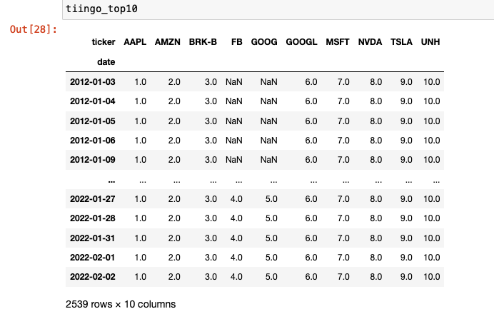
We begin by creating a list of the top10 S&P500 constituents. At the time of writing these were Apple, Microsoft, Amazon, Google (class A, GOOGL), Google (class B, GOOG), Tesla, NVidia, Berkshire Hathaway Inc (class B), Facebook and United Health Group. We create an empty dictionary and then loop through the tickers and create a string for the API call to the Tiingo API. We then call the API and pass the response to the JSON method. This JSON is then converted to a DataFrame. Finally we update our dictionary with the ticker as the key and the DataFrame as the value.
  # List of tickers to be downloaded
  sp_10 = ['AAPL', 'MSFT', 'AMZN', 'GOOGL', 'GOOG', 'TSLA', 'NVDA', 'BRK-B', 'FB', 'UNH']
  # create dictionary of DataFrames
  tiingo_data = {}
  for ticker in sp_10:
      tk_string = f'https://api.tiingo.com/tiingo/daily/{ticker.lower()}/prices?startDate=2012-01-02&endDate=2022-02-02/'
      response = requests.get(tk_string, headers=headers).json()
      tk_data = {ticker: pd.DataFrame.from_dict(response)}
      tiingo_data.update(tk_data)
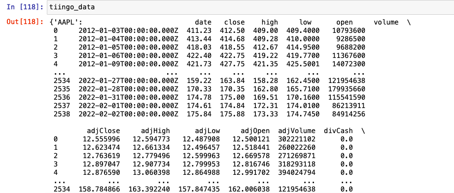
If we now call our variable tiingo_data the output in the jupyter notebook is as shown below. You can see that we have a numerical index and a datetime stamp that includes the time stamp. For end of day data this is simply 00:00:00.000.
A Note on Time Zones
Tiingo data is usually provided in UTC, however, if you are using Tiingo's intraday data you should be aware that The Investors Exchange (IEX) uses America/New_York timezone, which is Eastern Standard Time (EST - UTC-05:00) or Eastern Daylight Time (EDT - UTC-04:00) depending on the time of year. On the second Sunday of March at 02:00 EST the clocks in the Eastern Time Zone advance to 03:00. On the first Sunday of November at 02:00 EDT the clocks are moved back to 01:00. In Greenwich Mean Time, on the last Sunday of March at 01:00 GMT British Summer Time (BST - UTC+01:00) begins. This ends on the last Sunday of October at 01:00 GMT (or 02:00 BST), which brings the UK back to Greenwich Mean Time (UTC±00:00). It is worth spending some time understanding time zones in your data. They can be the source of many errors in your code.
Once we have our dictionary of DataFrames we can we convert the date to a datetime object and set the index. As the timestamp here has no meaningful impact on our analysis (we are using EOD data) we will remove it from the index.
  # fix date to datetime no TZ and set as index for all dataframes in dict
for k in tiingo_data.keys():
    tiingo_data[k]['date'] = pd.to_datetime(tiingo_data[k]['date'])
    tiingo_data[k] = tiingo_data[k].set_index('date').tz_localize(None)
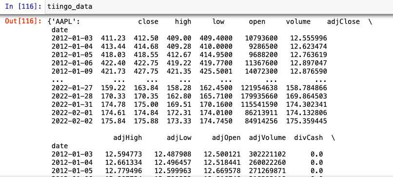
Now when we call tiingo_data we can see that our date is the index and the timestamp has been removed.
The DataFrames we have created from our JSON downloads will not have any labelled rows for missing dates. They will simply have consecutive rows of the data points provided by the data vendor. In order to determine if there is any data missing we will need to create a list of all the trading days between our start and end dates. Those of you with sharp eyes will have already noticed that although the requested date range for our data begins on March 1st 2012 both Metaverse (Facebook) and Google class B shares were not trading at that time. Google class b shares began trading on March 27th 2014 and Metaverse (FB) on May 18th 2012. By using a complete date index for the trading period we will by intention have missing data points for both these tickers. This then allows us to demonstrate how to visualise coverage using this method.
Creating a trading calendar is an essential skill to learn if you wish to carry out more realistic backtests. Although Pandas has a USFederalHolidayCalendar it is not consistent with a Trading calendar. Trading is not carried out on Columbus Day or Veteran's Day but it is carried out on Good Friday. Creating your own trading calendar can be done in Pandas by using the AbstractHolidayCalendar class. However, there is also an excellent open source library Pandas-Market-Calendars, which has been maintained regularly since December 2016. It offers holiday, early and late open/close calendars for specific exchanges and Over The Counter conventions. The latest release, version 3.4 at time of writing, is only available to install via the python package manger PIP. The Conda package manager has an older version which is not compatible with later versions of Pandas. It is generally not good practice to use pip to install packages through conda as these packages will be installed on a different channel. In this case however, it is necessary to obtain the correct version of the package so we will be using pip to install this package inside our conda environment. You should bear in mind that if you were to ever use conda update inside this environment the Pandas Market Calendars package would not be updated.
Inside the anaconda environment you are working in pip install the package. If you are following along with the article series you can use the previously created environment py3.8.
(base)$ conda activate py3.8
Once inside the environment you can install the package. If you see a command not found error you will also need to install pip.
(py3.8)$ pip install pandas_market_calendars==3.4
We can now import the package by adding it to our imports
  import json
  import pandas as pd
  # NEW
  import pandas_market_calendars as mcal
  import requests
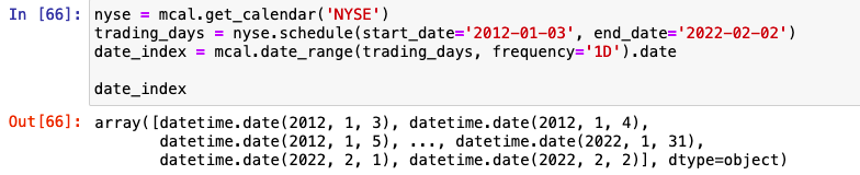
Below is the code to get all trading days for the New York Stock Exchange, and to create a schedule of dates for our chosen date range. We can then define the frequency at which we would like our datetimes, i.e. daily, hourly. Finally we remove the timestamp from the index. This is done so that we can compare the dates from our Tiingo data (where we have already removed the timestamp) with the dates in our bespoke trading calendar. This is saved as the variable date_index.
  nyse = mcal.get_calendar('NYSE')
  trading_days = nyse.schedule(start_date='2012-01-03', end_date='2022-02-02')
  date_index = mcal.date_range(trading_days, frequency='1D').date
Calling our variable date_index inside our notebook shows us an array of datetimes as below.
We now have a dictionary of DataFrames containing our OHLCV data from Tiingo where the keys are the tickers and the values are the DataFrames. We also have a date_index of the all trading days within our date range. To see if there are any missing adjusted close prices we will need to create a close price DataFrame for each stock where the index is our date_index and the columns are the close price series for every ticker. This is created in a similar way to the close price series creating in our last article An Introduction to Stooq Data. As such we will only describe the code in brief.
We first create a list of Pandas Series containing the adjusted close price for each ticker. The index of each series will be the original date index from our data provider. As such they will have different lengths and we will not be able to concatenated them. We then create a MultiIndex object where level 0 is the ticker and level 1 is our new variable date_index with dates for all trading days in the date range. Now we reindex each series in the list filling any missing values with numpy NaNs. For this we will need to import numpy. Now that we have a list of series with matching length we can concatenated them with pd.concat().
  import json
  # NEW
  import numpy as np
  import pandas as pd
  import pandas_market_calendars as mcal
  import requests
  # create list of multIndexed series from adjusted close data
  ticker_series_list = []
  for k,v in tiingo_data.items():
      ticker_series = pd.Series(v['adjClose'].to_list(), index=tiingo_data[k].index, name='AdjClose')
      arrays = [[k]*len(date_index), date_index]
      new_index = pd.MultiIndex.from_arrays(arrays, names=['ticker', 'date'])
      ticker_amend = ticker_series.reindex(new_index, level=1, method=None, fill_value=np.NaN)
      ticker_series_list.append(ticker_amend)
close_series = pd.concat([series for series in ticker_series_list])
Then, as we showed in the previous tutorial, we can unstack them to become and MultiIndexed DataFrame
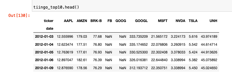
tiingo_top10 = close_series.unstack()
And finally transpose the MultiIndexed DataFrame, swapping the rows and columns to give us our final DataFrame with adjusted close price for all tickers across all trading days in our chosen date range.
tiingo_top10 = tiingo_top10.T
You should now have a DataFrame that looks as below. You can see the NaNs present in both the FB and GOOG adjusted close price where there is no data available.
Now that we have our adjusted close price DataFrame we can create our coverage image. Imshow works by plotting values as colour points based on the chosen colourmap. It is possible at this point to simply plot our data using plt.imshow(tiingo_top10.values, aspect='auto'). This can be a good way to visualise aspects such as price trends. However, when you are dealing with a large number of tickers and a wide date range it is easy to miss a blank square if there are a number of different colours visible. To evaluate data coverage the first thing we need to do is mask our data such that all cells which do not contain NaNs will be changed to 1. That is all cells with a numerica value will simply be 1 rather than the price. We can use the Pandas methods df.mask() and df.notna() to achieve this.
# replace all values that are not NaN with 1
  tiingo_cov = tiingo_top10.mask(tiingo_top10.notna(), 1)
We can now create the image using imshow to see whether there are missing data points. We use imshow with df.values() to return a numpy array of the values in the DataFrame and the keyword aspect="auto" to fill the axis. For a datset this size it allows better visualisation than using the default aspect="equal" where each pixel is displayed with equal aspect ratio i.e. a square.
plt.imshow(tiingo_cov.values, aspect='auto')
With a little more processing we can obtain the same data coverage figure but with different colours for each stock and more clearly labelled axes. This figure is shown below.
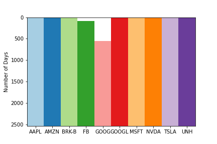
In order to create this figure, we can use the same amsking method but we need to vary the integer we use for each stock. This allows the colourmap to display a different colour for each stock and a blank space for any Nans. We will also create a subplot so that we can access the axes object and use the ax.set_xticklabels() method. We will also be making use of a third party colourmap library Palettable. Palettable provide a large number of different colourmaps that can be selected based on the number of elements you would like to colour and the type of colourmap you wish to create. There is an excellent article here which describes how to select a colourmap based on the data you are showing. As our stocks are independant they have no ordering and our dataset is considered qualitative. In this case we use a qualitative colourmap.
To create a mask with a different number for each column we can enummerate through the columns in the DataFrame and apply the mask in place, using the counter in the enumerate method to change the value of the mask for each column. The following code will apply the number 1.0 to any cell in the first column that does not have an NaN, it will apply 2.0 to the cells in the second column and so on up to the last column.
  for i, col in enumerate(tiingo_top10):
  tiingo_top10[col].mask(tiingo_top10[col].notna(), i+1, inplace=True)
Our DataFrame should now appear as below.
To create the figure we will begin by installing palettable, as described in the documentation the package is available through pip. We will need to do this inside the virtual environment we previously created.
(py3.8)$ pip install palettable
Now we need to import our chosen colourmap. We have chosen Paired_10 from the module palettable.colobrewer.qualitative.
  import json
  import numpy as np
  import pandas as pd
  import pandas_market_calendars as mcal
  import requests

  # NEW
  from palettable.colorbrewer.qualitative import Paired_10
Now we can create our subplot. The Matplotlib method plt.subplots() returns a tuple of figure and axes object instances. Your final plot will be composed of a figure which encapsulates all the subplots and individual axes objects for each subplot. The individual axes objects are returned as a list in the second element of the tuple. The figure object allows you to call methods on the whole figure such as fig.title, whilst the axes object allows you to call methods on the indivdual axes objects such as ax.set_xticks. Although we are only creating a single figure here this methodolgy would allow us to expand to multiple axes objects if required.
First we create our figure and subplot, then we use the imshow() method on the axes object passing in our chosen colourmap. We set the interpolation to the string 'none', as this stops blur between the data points in the final image. This blurring effect is only visible when we use multiple colours. We then create a list of tickers from the tiingo_top10 DataFrame column names. In order to set these as x axis labels we must assign both a location and a label. As the previous axis labels were simply a zero indexed count of the columns we can use 0-9 to locate our new labels. We also set the y axis label for clarity.
  fig, ax = plt.subplots(1,1)
  ax.imshow(tiingo_top10, aspect='auto', cmap=Paired_10.mpl_colormap, interpolation='none')
  x_label_list = tiingo_top10.columns.to_list()
  ax.set_xticks([0,1,2,3,4,5,6,7,8,9])
  ax.set_xticklabels(x_label_list)
  ax.set_ylabel("Number of Days")
And that's it. Adding in the different colours for each stock along with the x axis labels has really helped to define each ticker. We can see the missing data clearly for GOOG and FB. In this example we only look at ten stocks but this method can be applied to thousands of tickers in order to evaluate the quality of the data you are receiving. Rather than spending hours trawling through DataFrames or running commands to search for missing values using imshow allows good, quick visibility of a dataset.