In this article we will access the Polygon API and download a month of intraday minutely Forex data. We will show you how to access the API, creating a Python function that can be easily adapted to extract FX data for various pairs across different timespans. We will also create and visualise a returns series with Pandas. This article is part of a series on Forex data, in later articles we will be using realised volatility to train a machine learning model and predict market regime.
In order to follow along with the code in this tutorial you will need:
- Python 3.9
- Matplotlib 3.5
- Pandas 1.4
- Requests 2.27
We also recommend that you take a look at our early career research series to create an algorithmic trading environment inside a Jupyter Notebook. We will begin by looking at how the Forex market is divided in 2023.
Polygon.io and the Forex Market
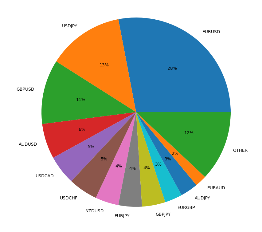
The forex market consists of highly traded or Major FX pairs and thinly traded or Exotic FX pairs. Currently the majority of the volume of forex trades is carried out on three major FX pairs; EURUSD, USDJPY and GBPUSD. However, there are many more pair combinations.
In fact Polygon has data on 1000 forex pairs. Polygon.io was founded in 2006 and "Built by developers for developers". They aim to provide developers with frictionless access to the most accurate historical and real-time data available. Polygon offers an API for Stock, Options, Crypto and Forex data. They have 100% market coverage for US equities, with data from all US exchanges and OTC venues. Their options data includes active and historical options contracts, greeks and implied volatility. In addition, Polygon have 166 Crypto currency tickers with data from four different exchanges including Coinbase and Kraken. For Forex data, they offer tick by tick updates on all 1000 currency pairs. Under the individual use license Crypto and Forex data are licensed together on either a Basic (free) or Currencies Starter (premium) package. The Basic Currencies Subscription gives you access to a maximim of 5 API Calls per minute, end of day data at various timespans and with up to 2 years of history, reference data and aggregate bars.
In this tutorial we will be using the Polygon API to obtain 1 month of intraday (minutely) Forex data for a major and an exotic FX pair. We will show you how to obtain data from the API using the simplejson and requests Python libraries. We will create a returns series for both FX pairs using Pandas and explore some of the gotcha's that can occur when working with and plotting time series data. Let's get started by signing up to a Basic Currencies subscription. This is free and will give you an API key that you can use to access Forex data.
Using the Polygon API
Head over to the Polygon website and click on Get your free API key. Once you have signed up and signed in you can view your API key under the Dashboard dropdown menu by selecting API Keys, it will also be displayed for you when you view the documentation. Polygon's documentation is incredibly thorough and easy to use. You can formulate your API request using the dropdown menus on the website. Once you have selected the options you require the API URL will be displayed for you beneath the dropdowns. Have a look at their getting started documentation to see this in action.
One of the first things to notice about the forexTicker parameter in the market data API end point is that all FX pairs in Polygon are prefixed with C:, so for EURUSD we will need to use C:EURUSD in the API call. If you are unsure of the correct ticker to use you can query the Reference Data Endpoint using the Tickers parameter. Here you can specify the market you are interested in (FX, Crypto, stocks etc) and by leaving the ticker parameter blank you can obtain all tickers for that market. The default setting for the limit parameter returns 100 results, which you can change to a max of 1000. Now that we know how the tickers are formatted let's take a look at how the rest of the API call will be formed.
Each API call to the market data end point begins with the same https address https://api/polygon.io/v2/aggs/ and every API call ends with your unique API key. This motivates the creation of variables in our code to prevent repetition. Below we will start to build up the code that will contact the API.
import json
import matplotlib.pyplot as plt
import pandas as pd
import requests

POLYGON_API_KEY = 'YOUR_API_KEY'
HEADERS = {
    'Authorization': 'Bearer ' + POLYGON_API_KEY
}
BASE_URL = 'https://api.polygon.io/v2/aggs'
Here we have created three global variables which can be accessed by all the functions we will create later in the code. The POLYGON_API_KEY will store your API key so that you don't need to keep writing it. The HEADERS dictionary holds the authorization header as shown in the Polygon getting started documenation. Finally we have the BASE_URL which holds the start of the API call. We are now ready to create our first function which will shape the API call for Forex minutely data.
pg_tickers = ["C:EURUSD", "C:MXNZAR"]

def get_fx_pairs_data(pg_tickers):
    start = '2023-01-01'
    end = '2023-01-31'
    multiplier = '1'
    timespan = 'minute'
    fx_url = f"range/{multiplier}/{timespan}/{start}/{end}?adjusted=true&sort=asc&limit=50000"
    fx_pairs_dict = {}
    for pair in pg_tickers:
        response = requests.get(
            f"{BASE_URL}ticker/{pair}/{fx_url}",
            headers=HEADERS
        ).json()
        fx_pairs_dict[pair] = pd.DataFrame(response['results'])
    return fx_pairs_dict
The function get_fx_pairs_data(pg_tickers) takes the parameter pg_tickers. This is simply a list of tickers which can be defined in a cell above the function if using a notebook or defined in the __main__. This list can be easily extended but bear in mind that using a free API key gives you only 5 API calls per minute. Here we have chosen to use the major pair EURUSD (Euro:US Dollar) and the exotic pair MZXZAR (Mexican Peso:South African Rand). Feel free to select any tickers you prefer. Inside our function we define the following variables start, end, multiplier, timespan this allows us to change the range and time span of the data we obtain easily. We then put all the parts of the URL together in the fx_url variable. Then (as we have done in previous tutorials) we can create our fx_pairs_dict which is a dictionary of DataFrames with the ticker as the key and the data as the value. Check out our tiingo article for more information on this. We can now call the function as below and our data will be stored in our fx_pairs_dict variable.
fx_pairs_dict = get_fx_pairs_data(pg_tickers)
The data for each pair can now be accessed by calling the dict variable with the key for the fx pair like so fx_pairs_dict['C:EURUSD'].
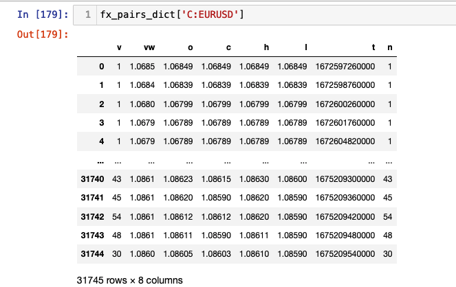
A full list of the column content can be found in the Polygon docs. The columns currently of interest to us include c, the adjusted close price and t, the timestamp. As you can see the timestamp is a Unix Msec value. Our next function converts this to a datetime and sets it as the index.
def format_fx_pairs(fx_pair_dict):
    for pair in fx_pairs_dict.keys():
        fx_pairs_dict[pair]['t'] = pd.to_datetime(fx_pairs_dict[pair]['t'],unit='ms')
        fx_pairs_dict[pair] = fx_pairs_dict[pair].set_index('t')
    return fx_pairs_dict
We can now call our function and pass in our fx_pairs_dict as follows: formatted_fx_dict = format_fx_pairs(fx_pairs_dict). This saves the formatted DataFrames into a variable called formatted_fx_dict.
We are now in a poistion to plot our close price series. This can be done by running the following code.
for pair in formatted_fx_pairs:
formatted_fx_pairs[pair].plot(y='c', figsize=(16, 10))
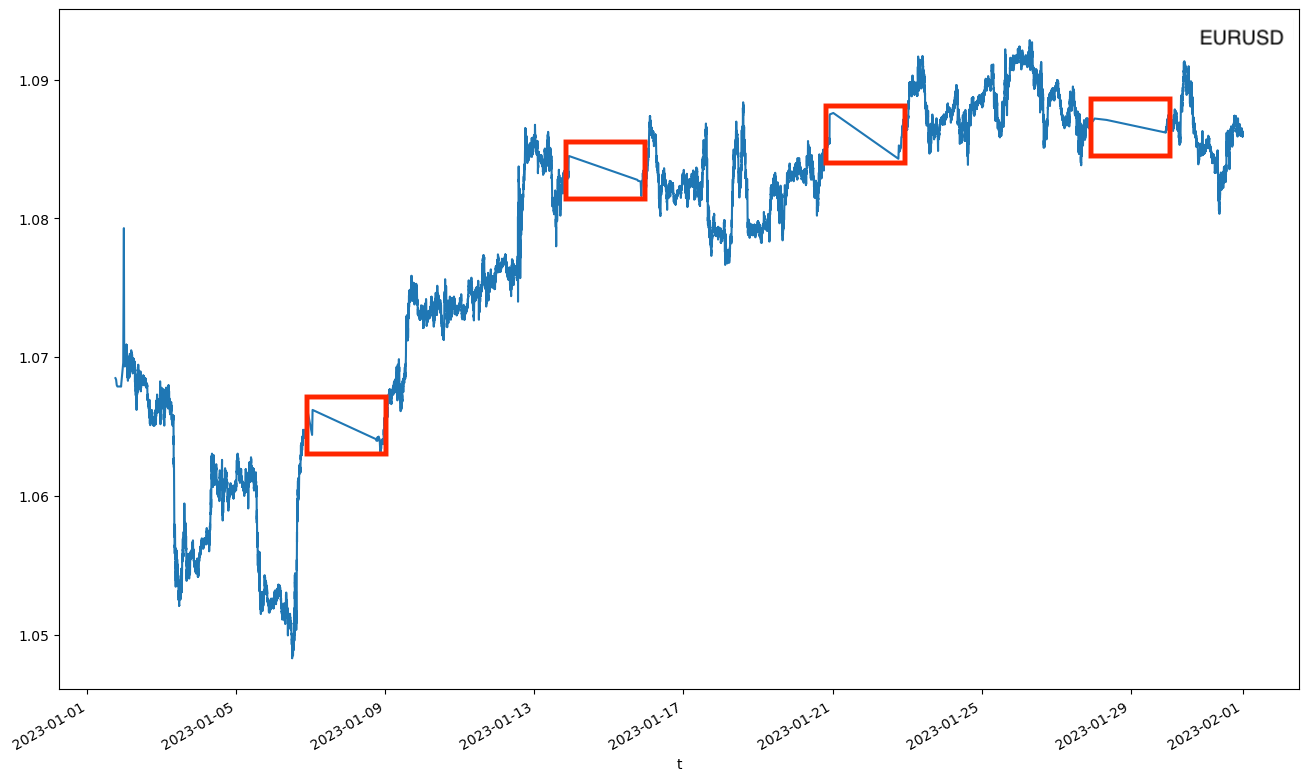
The following figure will be created for EURUSD. Unfortunately, as you can see there are gaps in the data which are displayed as repeated linearly interpolated slopes. Four of them are visible for EURUSD. If we examine the data more closely we find that these gaps coincide with periods where no trading was carried out. For our major FX pair, EURUSD, which is highly traded these occur infrequently.
The same phenomenon is seen in the exotic pair, MZXZAR. As this pair is not traded very often you can see the interpolation happen with much greater frequency.
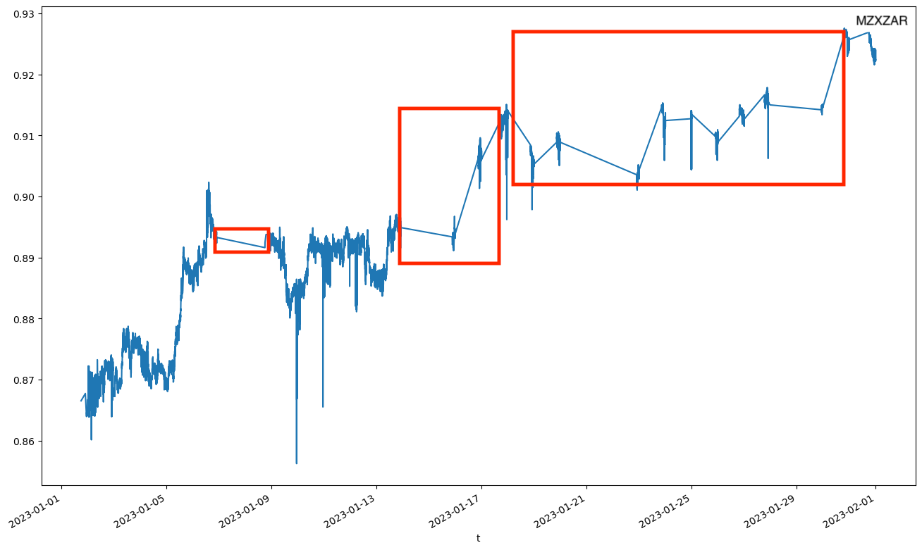
The reason for the gaps is due to the way the plotting function handles the DateTime index. The x axis is an evenly spaced time series that runs from the start to the end of the index. It displays all dates not just the ones in the index. For dates where there is no data the plotting function interpolates between the last known close price and the next known close price.
There are a number of options that you can consider to handle this type of issue when working with time series data. Should you wish for the index to mirror the plotting function and have a complete DateTime index Pandas offers the option to backfill or forwardfill the cells when creating the index. Backfilling the data would take the next non-Nan in the column and backward fill any blank cells. When working with a time series such as financial data you should never backfill your prices. This creates look-ahead bias, giving any trading algorithm access to future data, relative to the current time point. Forward filling uses the previous price to forward fill cells which contains Nans. This doesn't introduce look-ahead bias but you should be careful about whether or not you use it.
There are many different ways to back and forward fill. You don't need to simply copy the previous or next price. You could take an average or apply a number of different functions to calculate the value. However, it may not be appropriate to do any extrapolation of the data. This is where you need to think about the data and the questions you are asking. Ask whether or not the changes you are about to make are an accurate reflection of what is really happening with the data. Should the data you are working with be complete? Or do those missing data points mean something? In this case we are dealing with close prices that represent real trades of an FX pair. By forward filling the data we would be creating trades that hadn't happened. In this case it is simply safer to ignore or remove the missing data points from the graph.
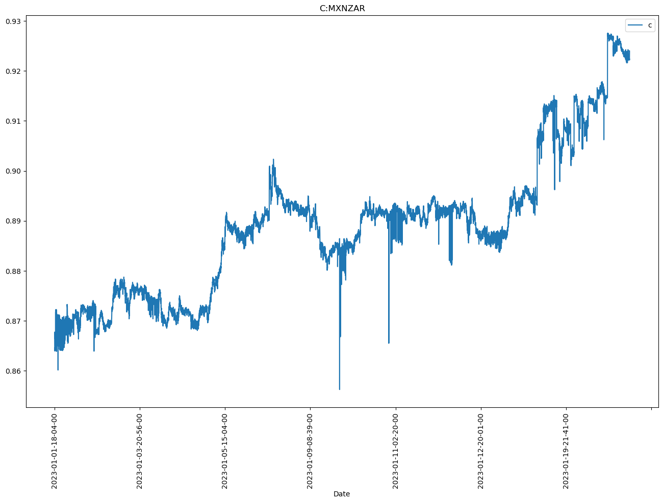
In order to display our closing price series without interpolation of missing data we need to create a string index of the timestamps. This will prevent the interpolation from taking place. Our index will still contain the timestamp of the trade but not as DateTime object.
def create_str_index(formatted_fx_dict):
    fx_pair_str_ind = {}
    for pair in formatted_fx_dict.keys():
        fx_pair_str_ind[pair] = formatted_fx_dict[pair].set_index(
            formatted_fx_dict[pair].index.to_series().dt.strftime(
                '%Y-%m-%d-%H-%M-%S'
            )
        )
    return fx_pair_str_ind
We can save the string indexed pairs into a variable by calling fx_pair_str_ind = create_str_index(formatted_fx_dict). If we plot our close prices again we can see that the interpolation has been removed.
We can now create our returns series safe in the knowledge that the plotting function will not include any interpolation of data. The following code creates the returns, these are simply the percentage change of the closing price.
def create_returns_series(fx_pairs_str_ind):
    for pair in fx_pairs_str_ind.keys():
    fx_pairs_str_ind[pair]['rets'] = fx_pairs_str_ind[pair]['c'].pct_change()
    return fx_pair_str_ind
We can now save our fully formatted dictionary of DataFrames into the fx_returns_dict variable using the following code.
fx_returns_dict = creat_returns_series(fx_pair_str_ind)
We can now plot our returns series for each pair. The following function can be used to make a subplot figure for any number of FX pairs. You need only change the shape of the array returned by matplotlib in the call to plt.subplots(rows, cols, *kwargs).
def plot_returns_series(fx_pairs_str_ind):
    fig, ax = plt.subplots(1,2, figsize=(16, 10), squeeze=False)

    for idx, fxpair in enumerate(fx_pairs_str_ind.keys()):
        row = (idx//2)
        col = (idx%2)

        ax[row][col].plot(fx_pairs_str_ind[fxpair].index, fx_pairs_str_ind[fxpair]['rets'])
        ax[row][col].set_xticks('')
        ax[row][col].set_title(fxpair)
    fig.suptitle("Returns Series 1/1/2023 - 31/01/23")
    plt.show()
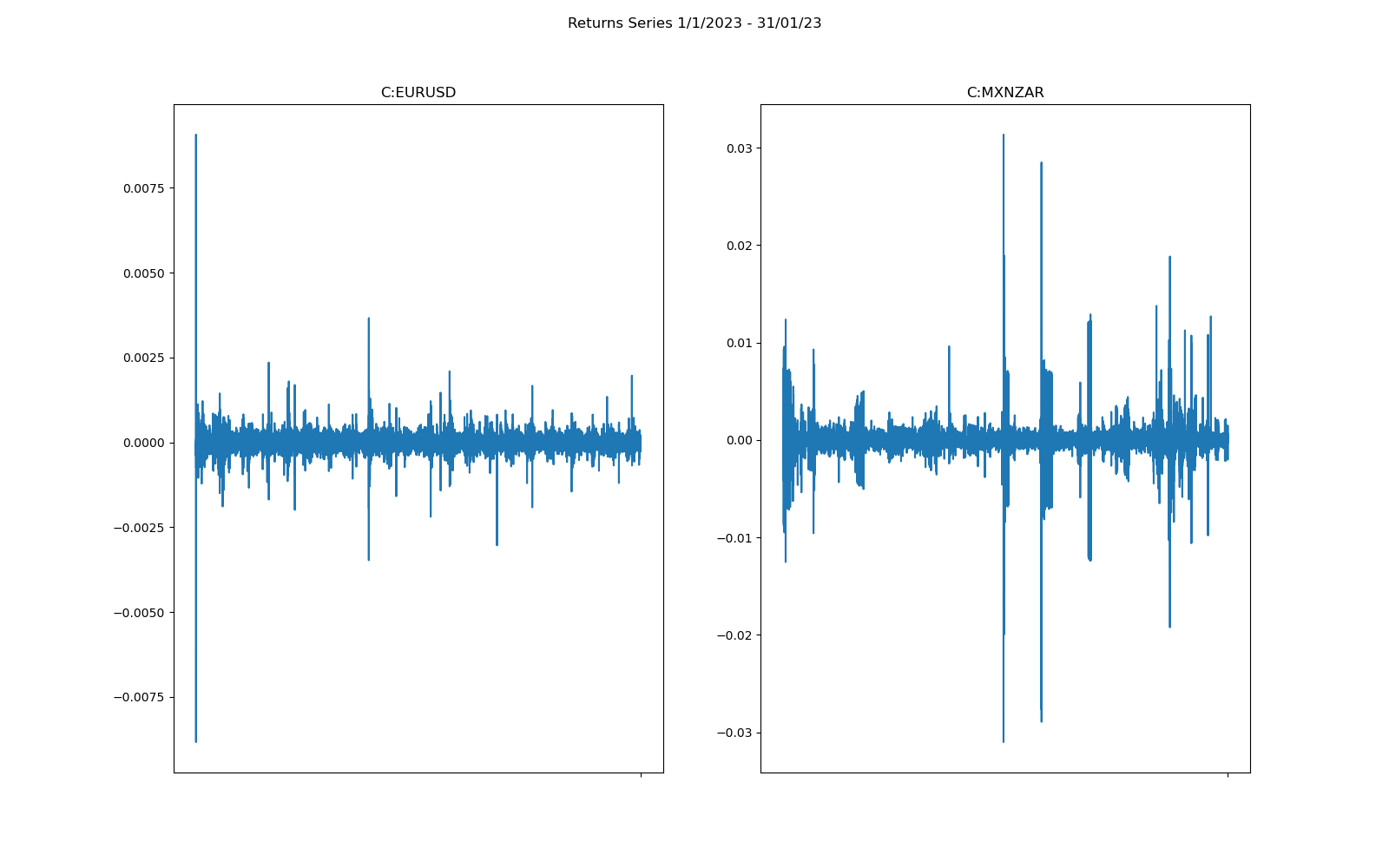
As you can see the returns are now plotted without any interpolation for missing data. At first glance it is fairly easy to see that there is far more variation in the exotic pair MZXZAR than for the major pair EURUSD over the same time period.
In the next article in the series we will be looking at how to create realised volatility. We will also be carrying out some data analysis and considering how we will begin to formulate our machine learning model to predict market regime change.